

Curtin University
- Things we did
- Branding Infographics Data visualisation Print design Presentation templates Document templates
- Client
- Curtin University
- Year
- 2019
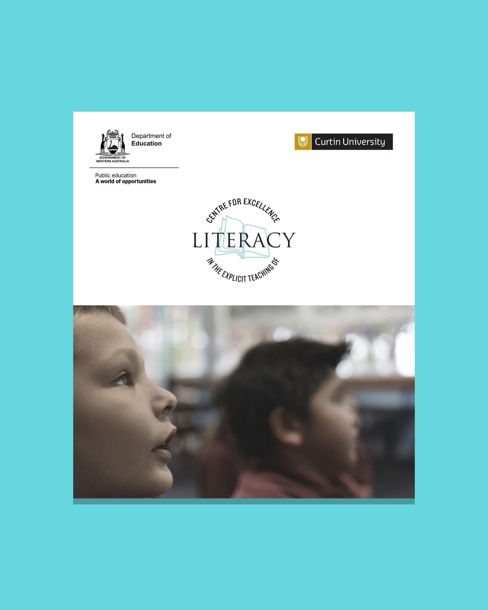
The Centre for Excellence in the Explicit Teaching of Literacy is a program for WA schools. After its video series premiered at a Department of Education event, Curtin University commissioned us to create the brand and the resources teachers use, from professional learning folders to planning tools and data visualisations.
The challenge
A video series for the Centre for Excellence in the Explicit Teaching of Literacy premiered at a Department of Education event. Curtin University then commissioned us to give the program one clear identity, and resources that carry its research, models and school data into professional learning for teachers.
What we did
We created the wordmark, colour palette, type and open book graphic device, then carried them through the professional learning folder and the PowerPoint and Word templates. We redrew the ecological model, key features, planning placemat and five school force field analyses so complex ideas read at a glance.




- Charcoal#333333
RGB 51/51/51 - Sky Blue#66D8DD
RGB 102/216/221 - Mid Grey#B3B3B3
RGB 179/179/179 - Violet#796EE5
RGB 121/110/229 - Red#EA1B1B
RGB 234/27/27 - Yellow#F7D969
RGB 247/217/105
Headlines
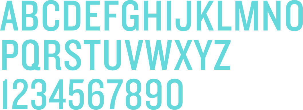
Knockout 29 Junior Lightweight
Capitals
Body text
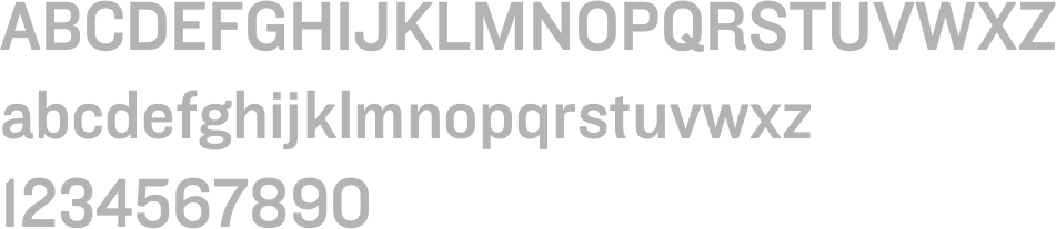
Knockout 31 Junior Middleweight
A clear identity
An open book sits inside the wordmark, then grows into a large graphic device across covers, dividers and slides. Sky Blue and Charcoal lead, a wider palette colour-codes the data, and Knockout keeps headlines clear and compact.
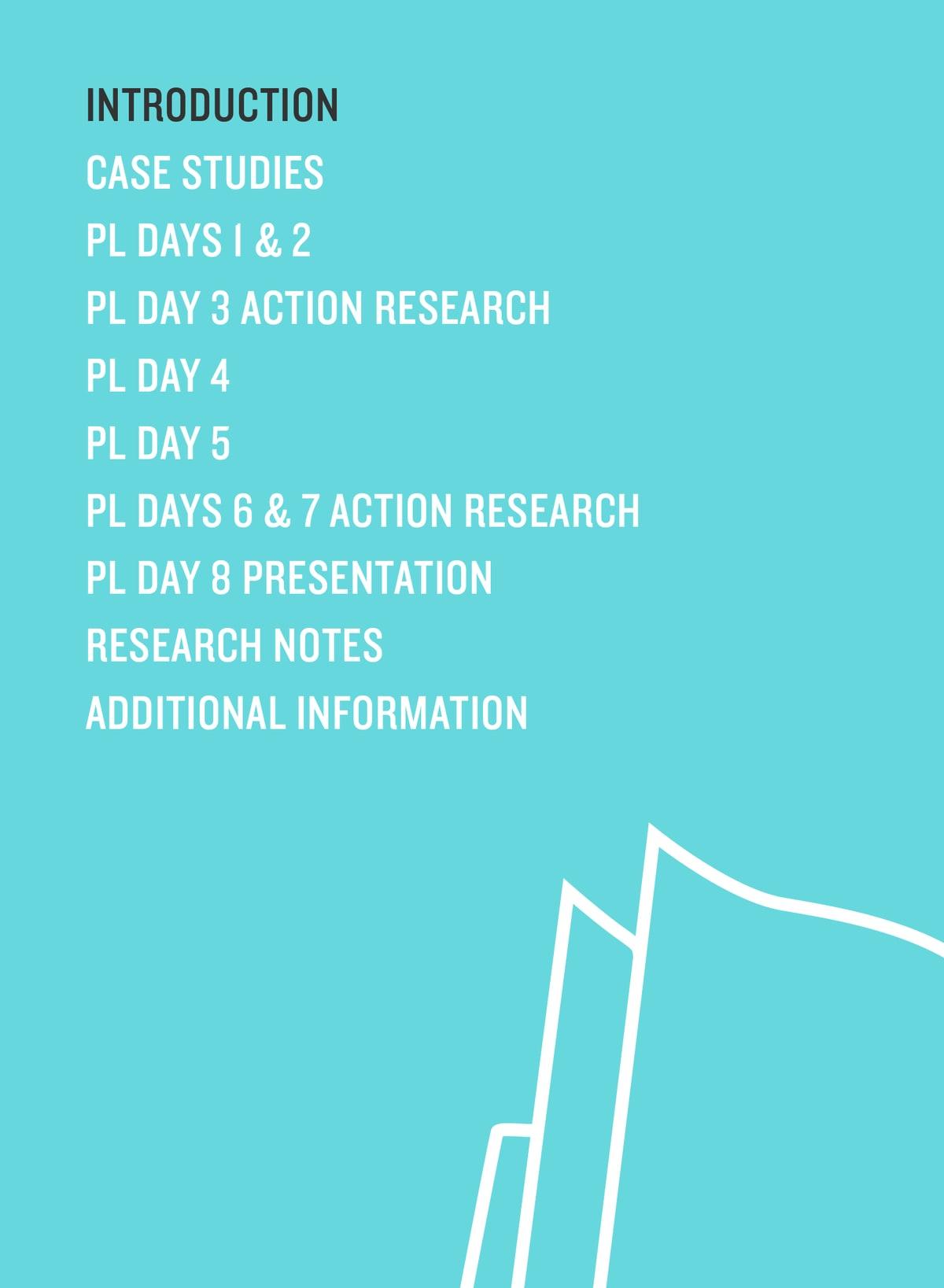
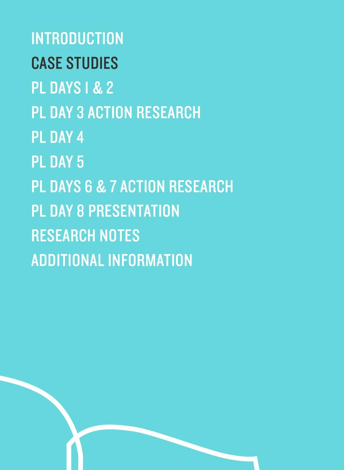
Professional learning folder
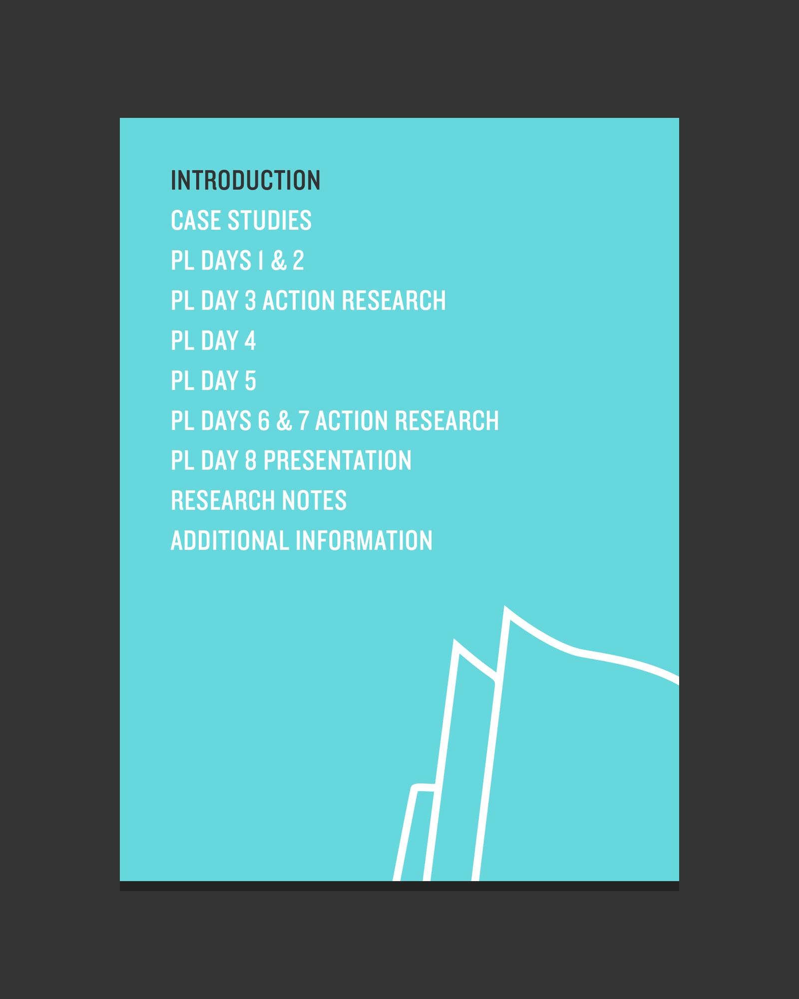
Teachers work through the program in an A4 folder, with a divider for each stage from the case studies to action research and the final presentation. One simple system keeps eight days of professional learning easy to find.
Ecological model
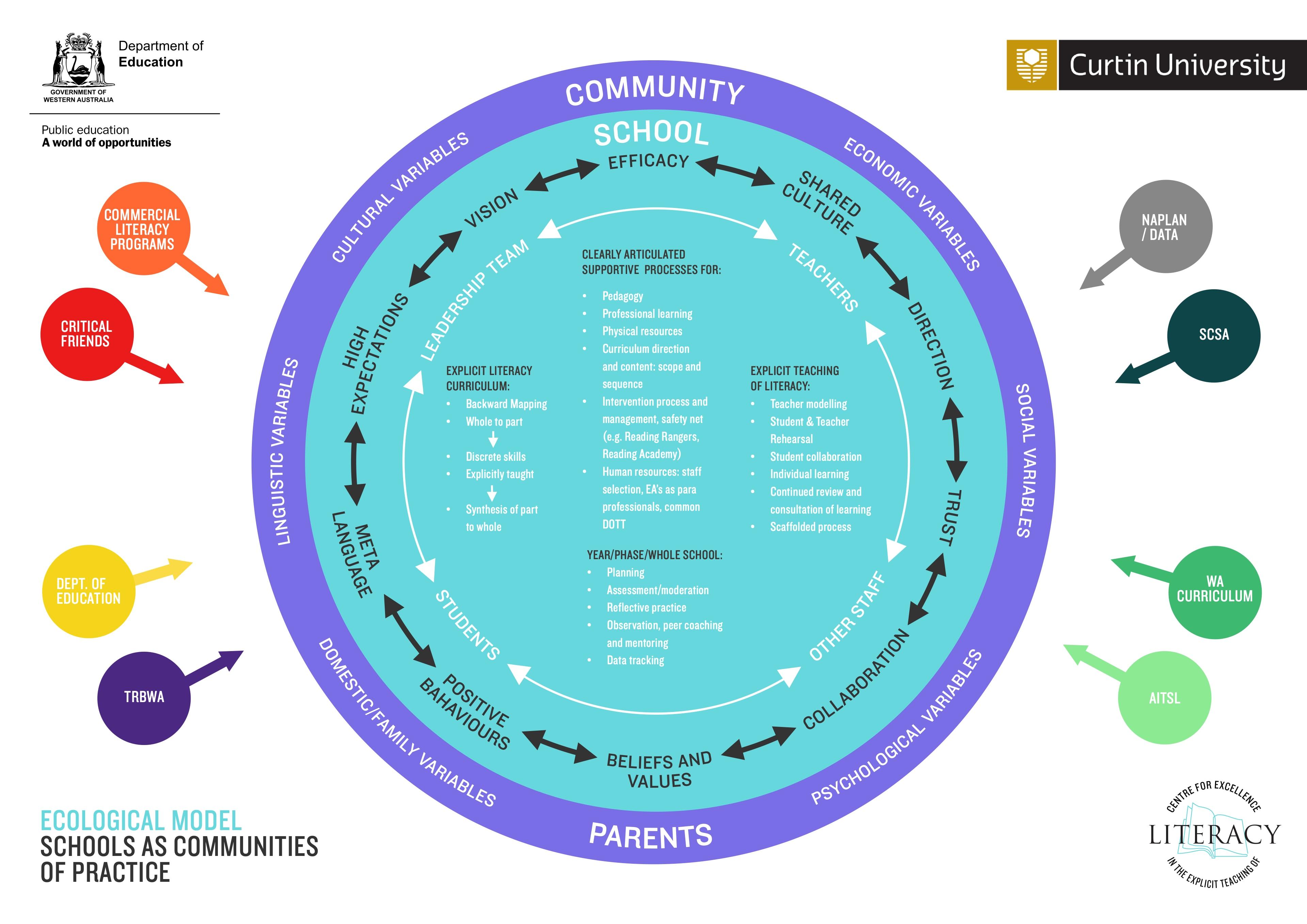
The ecological model shows a school as a community of practice, with leaders, teachers, students and other staff at the centre, and parents and the wider community around them. We redrew it so each layer and outside influence reads at a glance.
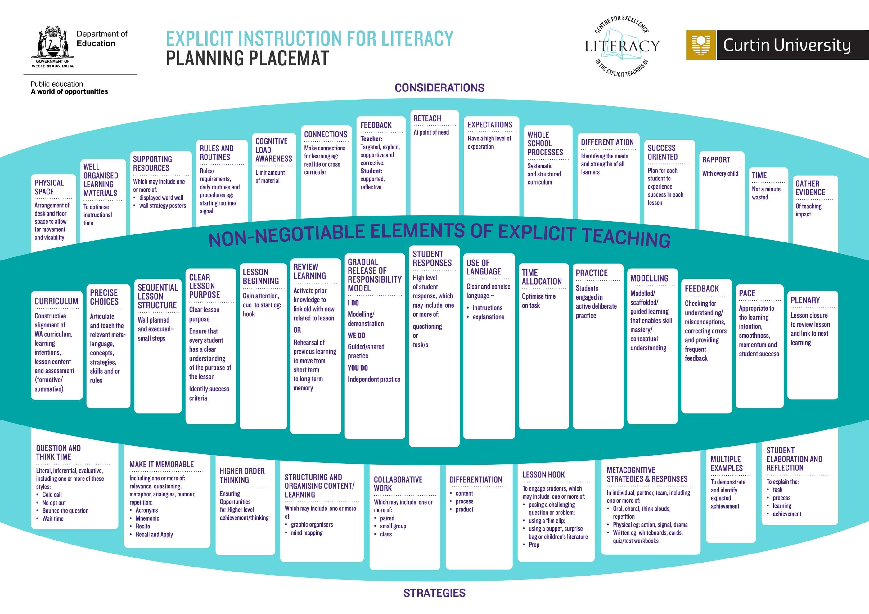
Key features and planning placemat
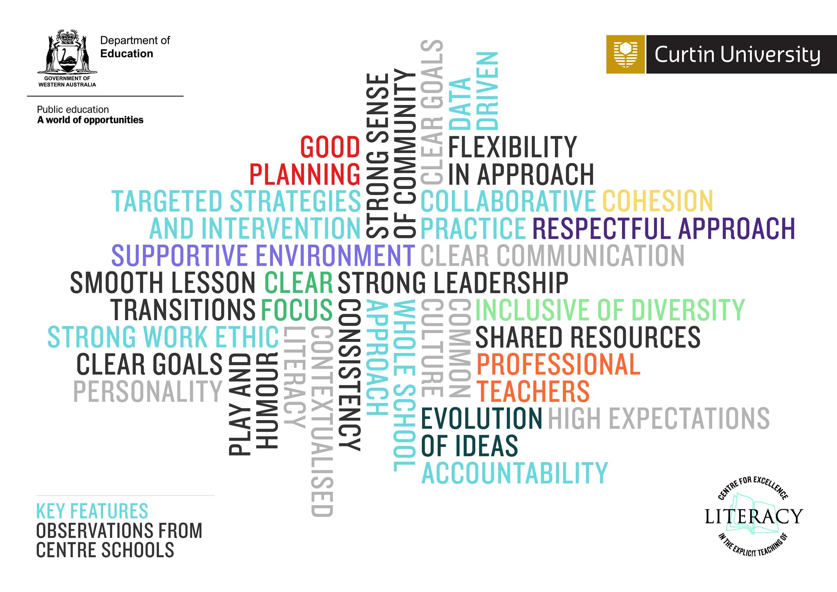
Observations from Centre schools became a key features word cloud, and the research on explicit teaching became an A3 planning placemat. Teachers can see the non-negotiable elements of a lesson on one page, with the strategies that support them.

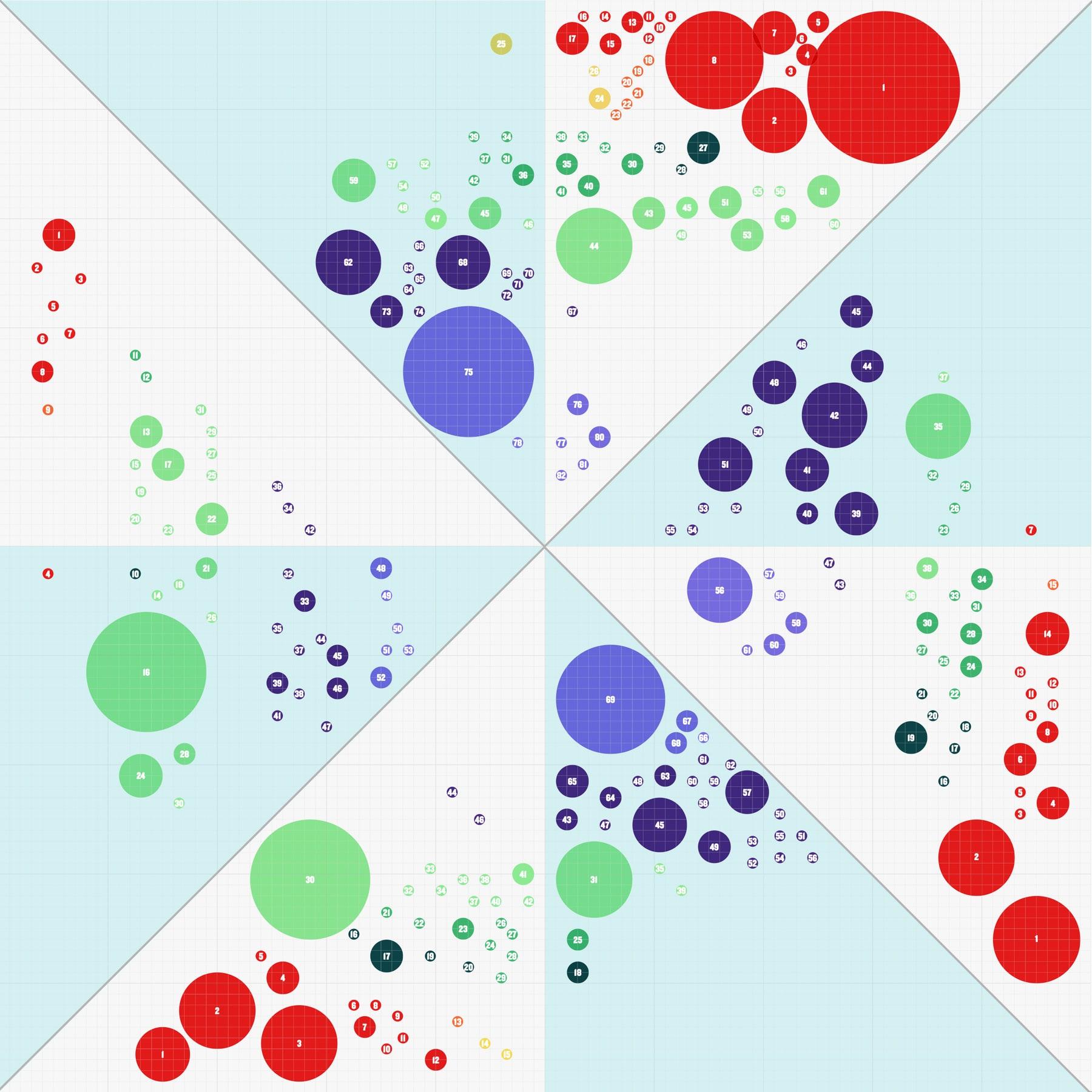
Force field analyses
Each school’s strengths and challenges were mapped across reading, viewing, speaking and listening, and writing. We turned pages of findings into a single A3 chart, where the size of each circle shows how often a theme came up and its colour shows where it sits.
The result
The Centre for Excellence now has one clear identity across every folder, slide and chart. Researchers, schools and the department share the same material, and teachers get complex ideas in a form they can use.
One identity, five schools and eight days of professional learning, all speaking the same language.