
Fuel to Go & Play
- Things we did
- Brand expansion Web app design
- Client
- Healthway
- Year
- 2019
Fuel to Go & Play is a Healthway-funded program for healthier food at community sport and recreation venues across Western Australia. We grew its logo into a full visual identity and designed the portal that tracks the work, venue by venue.

The challenge
Fuel to Go & Play supports sporting clubs and recreation centres to put healthier food on the menu. The brief was to expand the brand beyond its logo and develop a web app: a portal for the organisations involved in the program.
What we did
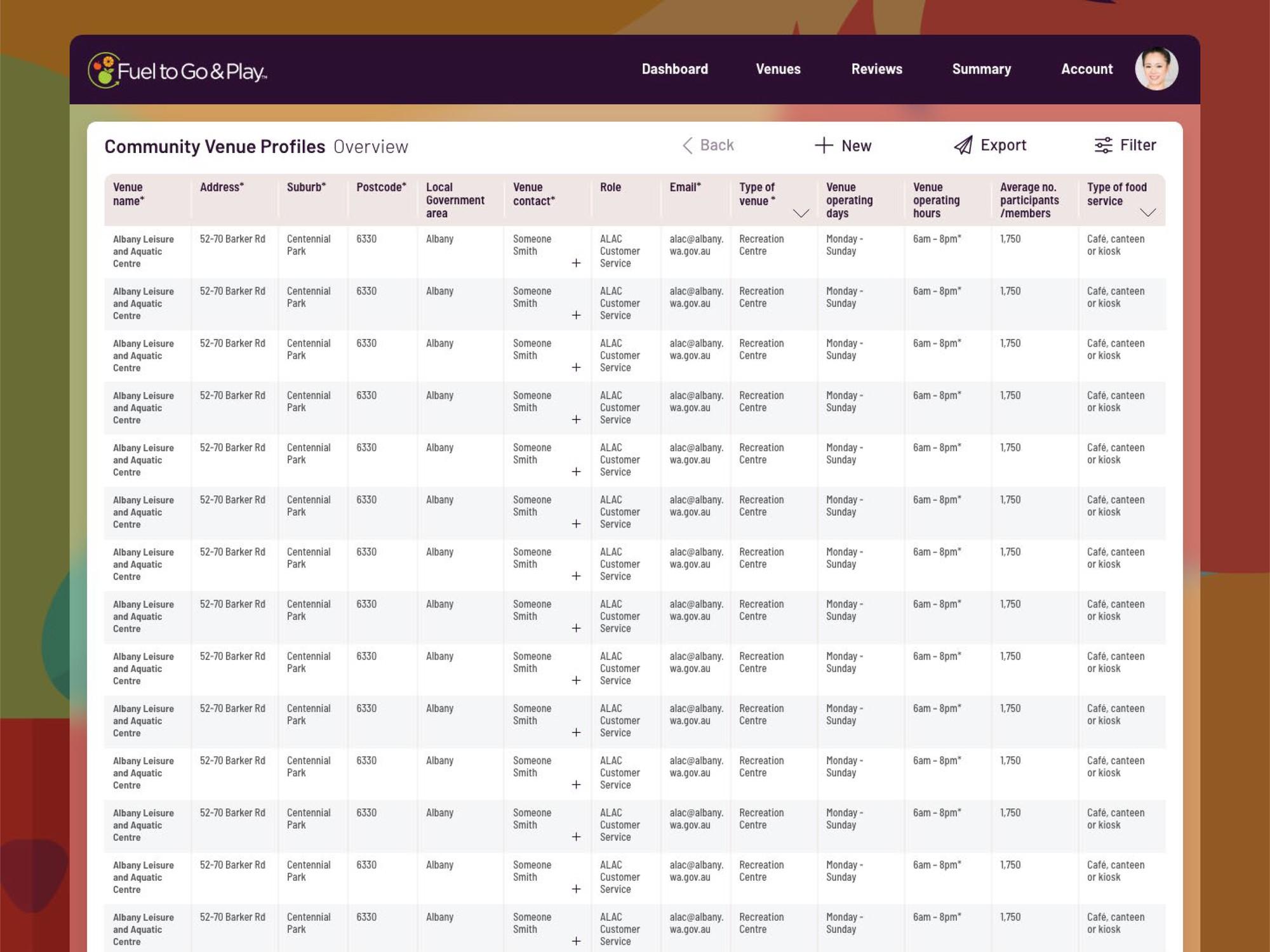
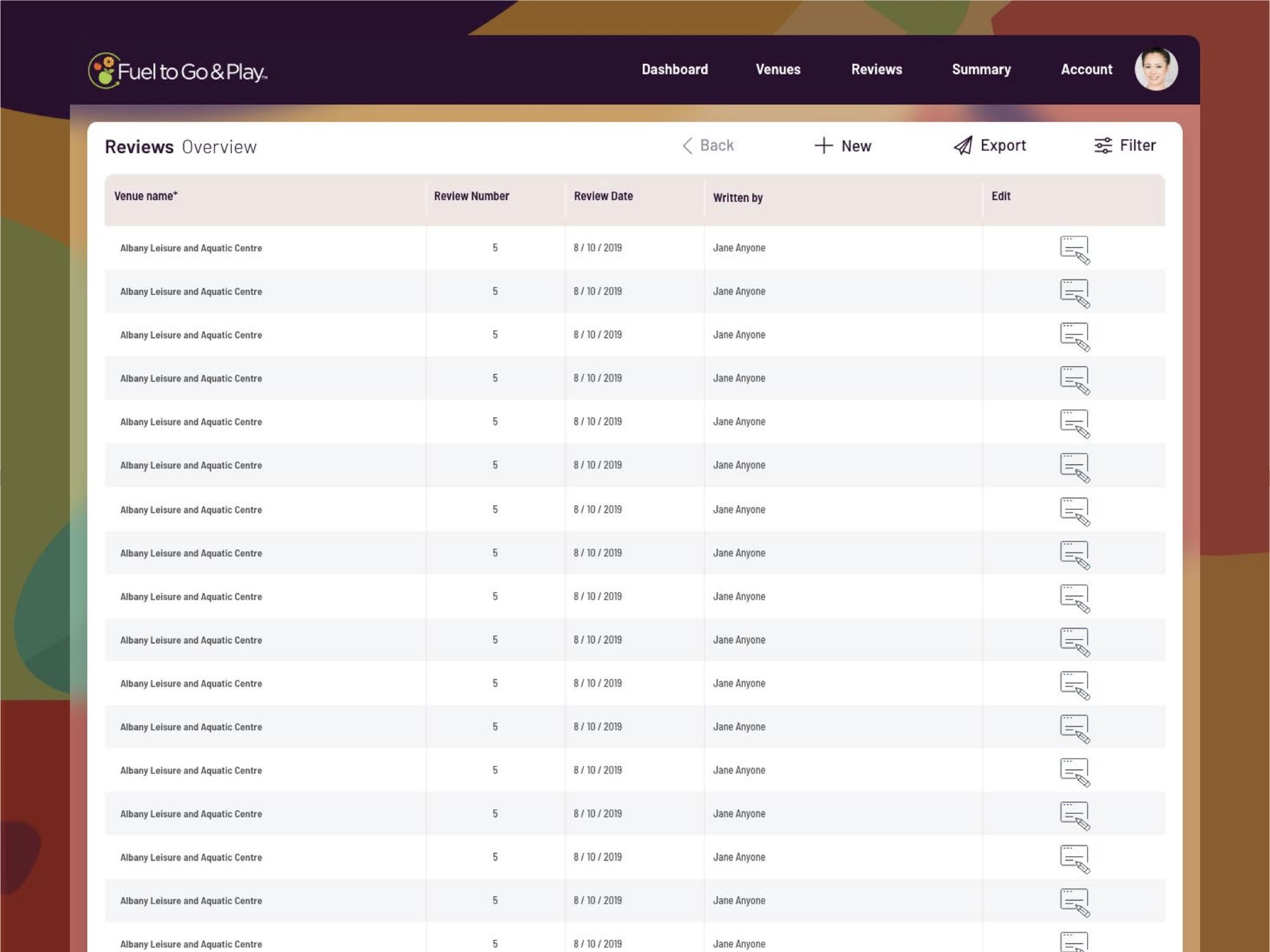
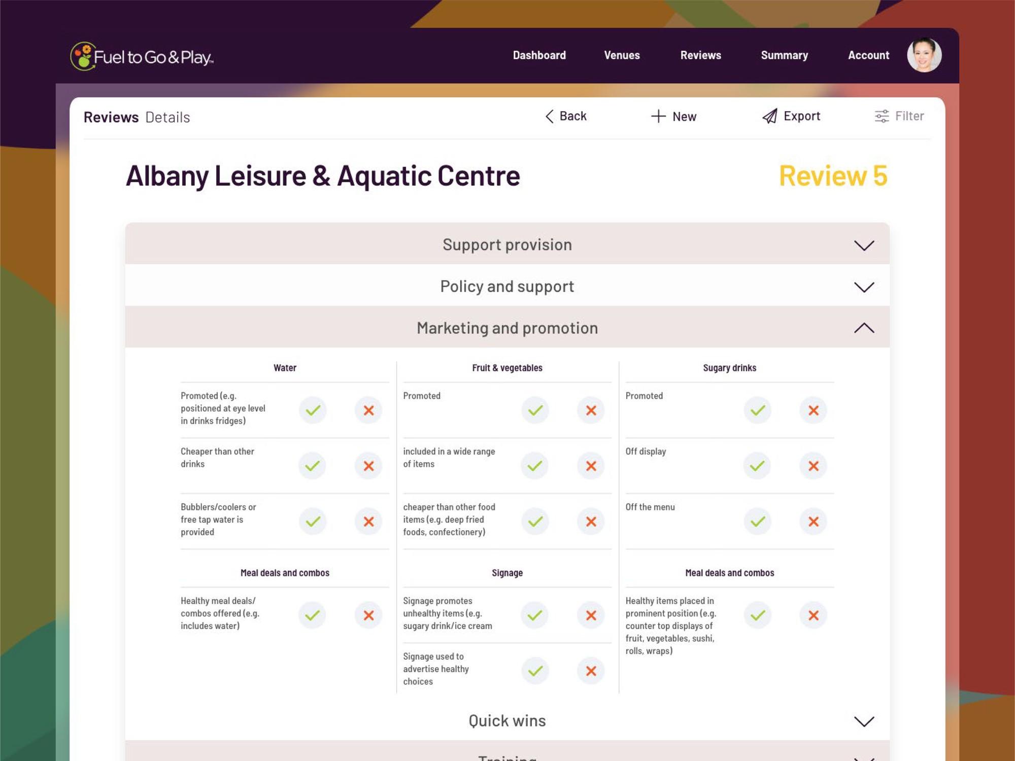
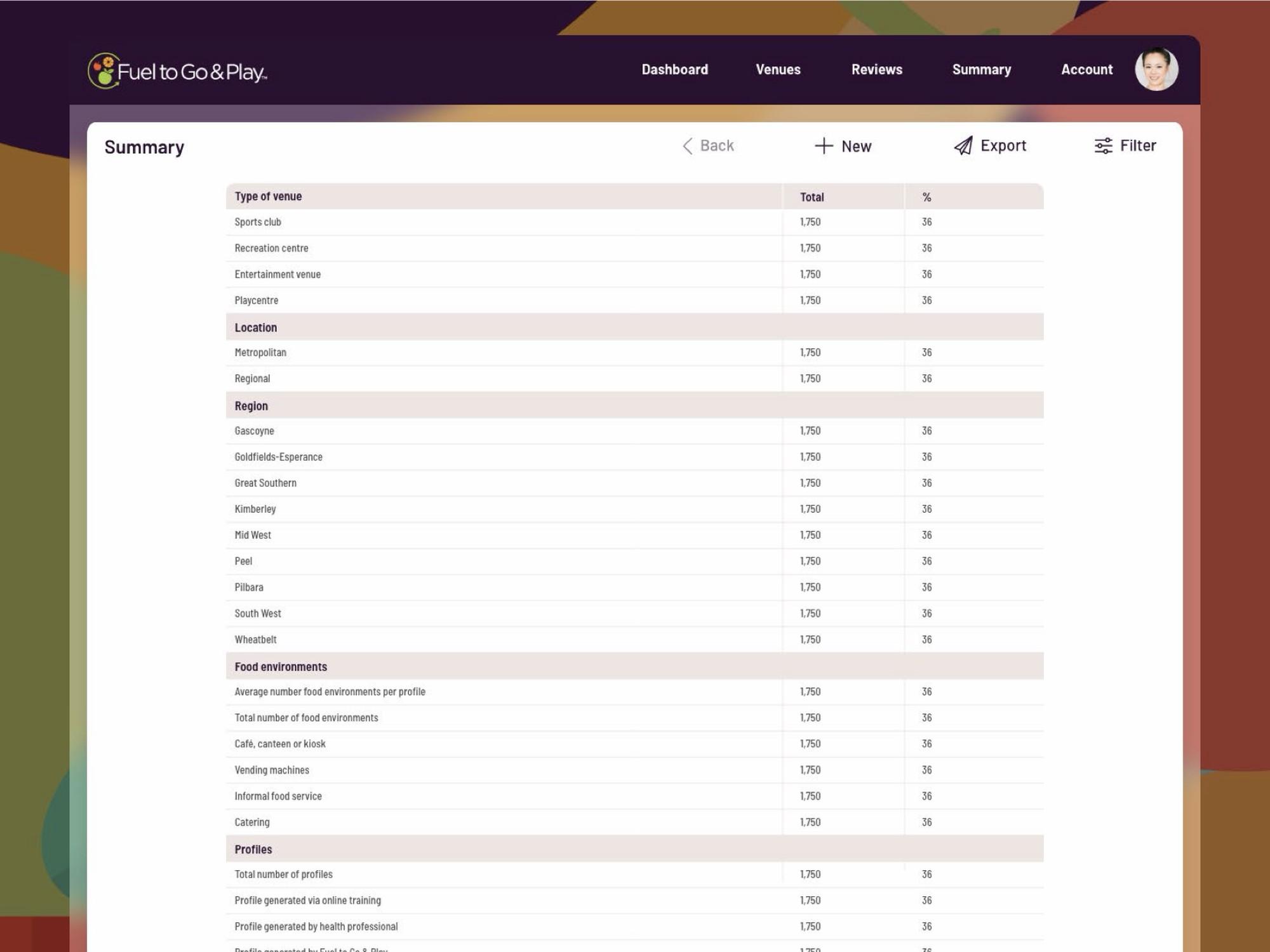
We took the fruit in the logo as our starting point and grew it into icons, a vivid illustration, a new palette and a single typeface, Barlow. Then we designed the web portal: a dashboard, venue profiles, menu reviews and summaries, all organised around the program’s traffic light system.


- Tomato#F15B25
RGB 241/91/37 - Mandarin#FAA61A
RGB 250/166/26 - Apple#A7CC3A
RGB 167/204/58 - Plum#2C0F31
RGB 44/15/49 - Eggplant#663497
RGB 102/52/151 - Banana#FCCA4F
RGB 252/202/79 - Leaf#37B36B
RGB 55/179/107 - Broccoli#A2DBB0
RGB 162/219/176
Headings and body text
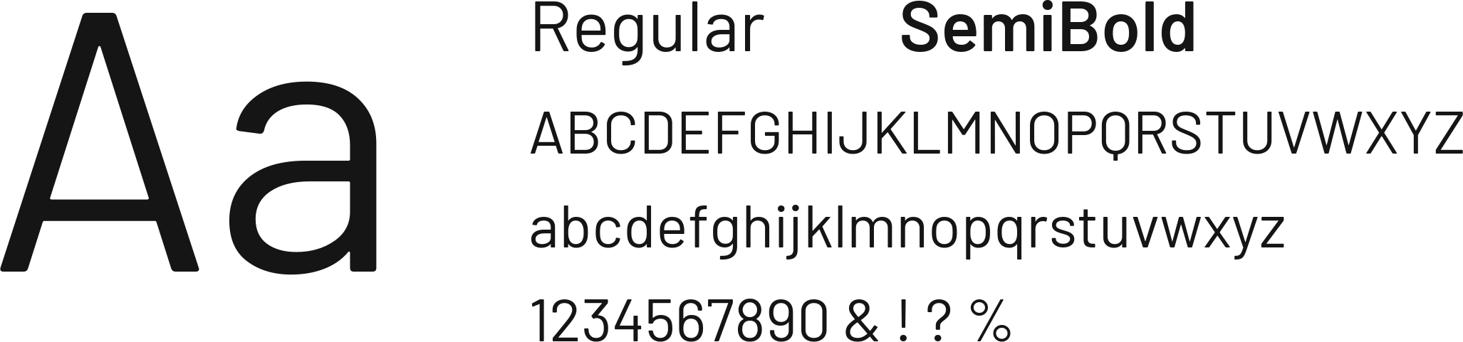
Barlow
Regular and SemiBold
Data tables
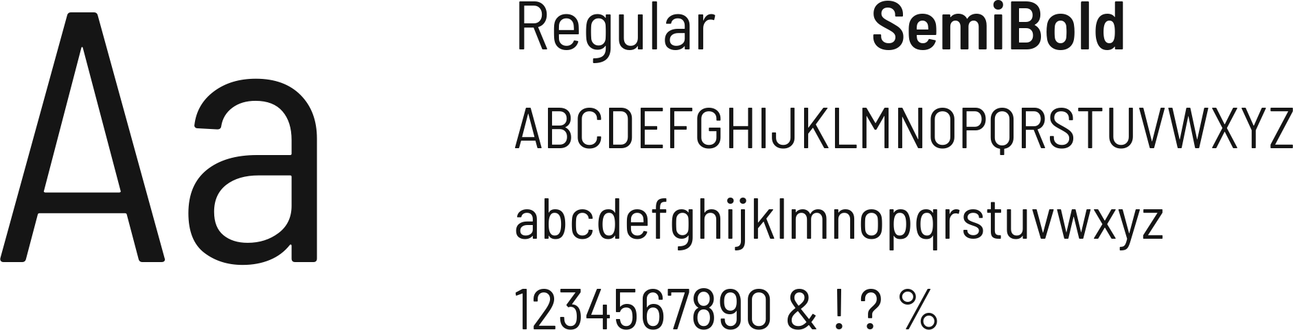
Barlow Semi-Condensed
Regular and SemiBold
Grown from the logo
The tomato, orange and apple in the logo set the direction. Ten new fruit and vegetable icons extend the family, and a secondary palette handles everything outside the traffic light system, which keeps red, amber and green for one job. Barlow displays reliably on every screen, with Semi-Condensed for tables.

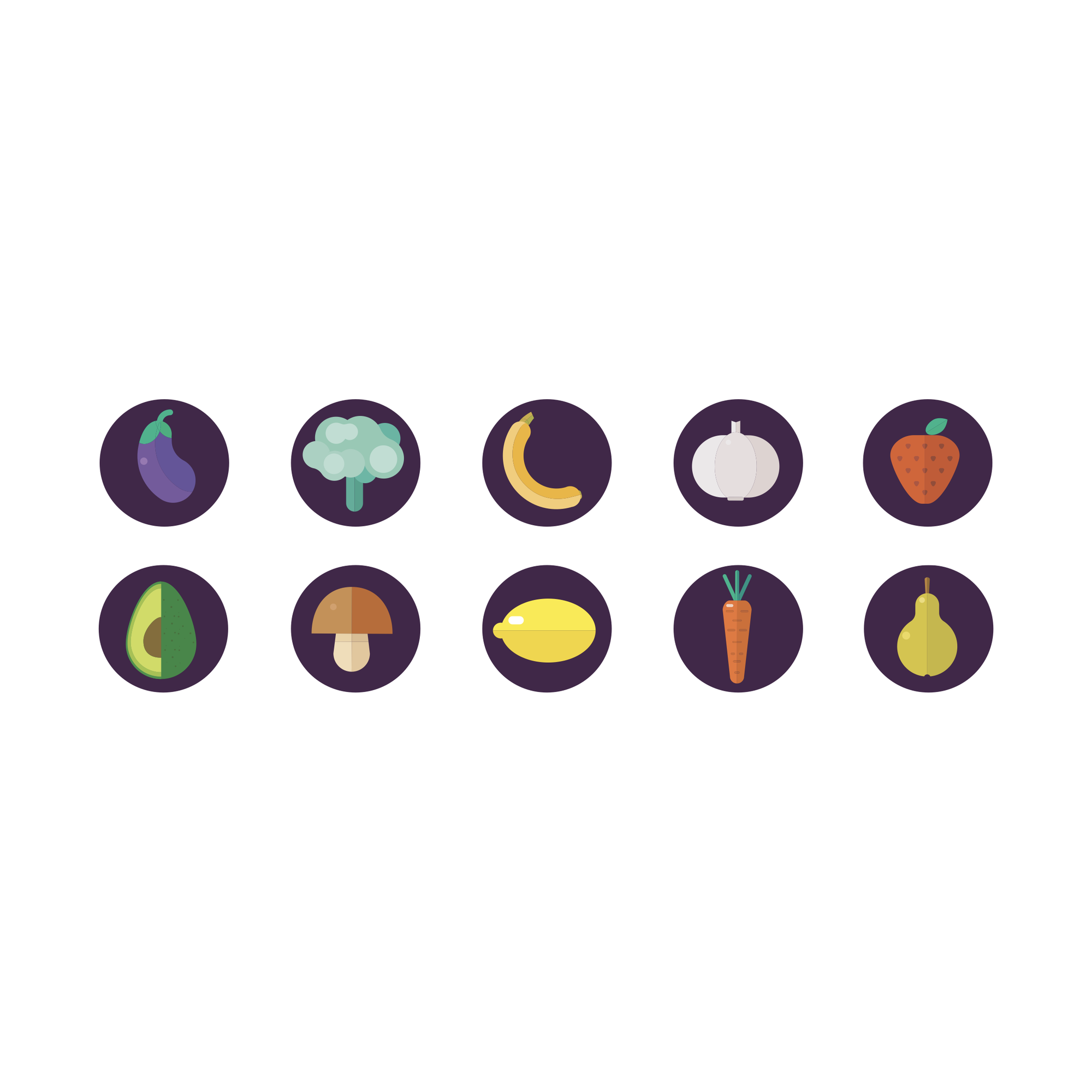
Illustration and icons
A rich wallpaper illustration turns fruit and veg into big, bold shapes. It sits behind the portal so a data tool feels as lively as the program it supports, while ten round icons carry the same fruit into smaller spaces.
Web portal
We designed the portal for administrators and health professionals. The dashboard gives a snapshot of venues, reviews and traffic light targets, each user sees the venues in their own area, and profiles and step-by-step menu reviews sit behind it.

New audiences
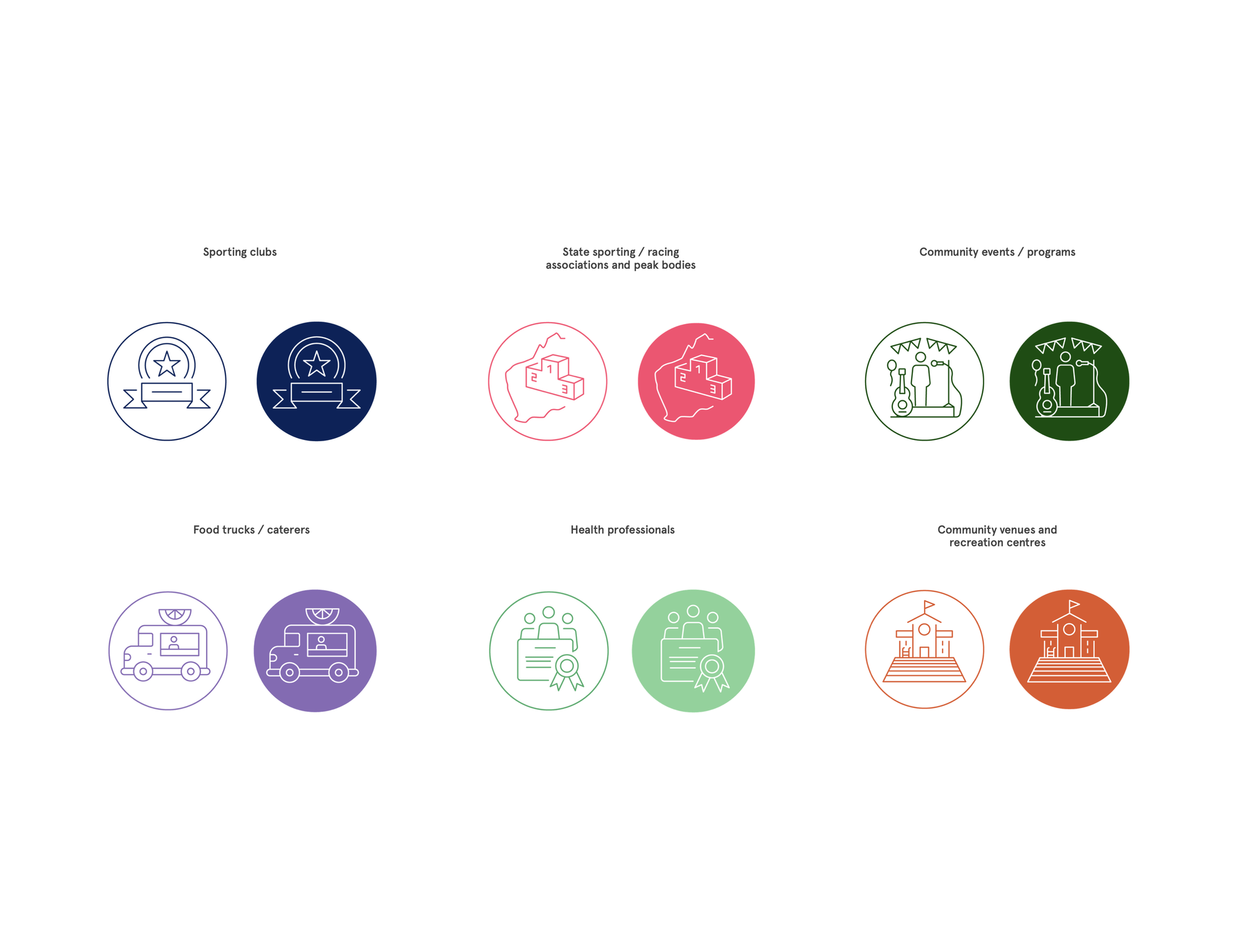
In 2021 the program moved to a new website, a hub for its tools and resources. We added a supplementary palette named after fruit and veg, from Dark Blueberry to Watermelon, and a line icon for each audience, from sporting clubs and food trucks to health professionals.
The result
One logo became a complete brand system, from icons and illustration to a full portal design. The client told us the palette and illustration worked really well, and stakeholders were particularly impressed by the dashboard and profile pages.
Healthy food deserves to look this good.