Northern Star Resources
- Things we did
- Report branding Creative direction Editorial design Photography direction Maps & graphics
- Client
- Northern Star Resources
- Year
- 2019–2023
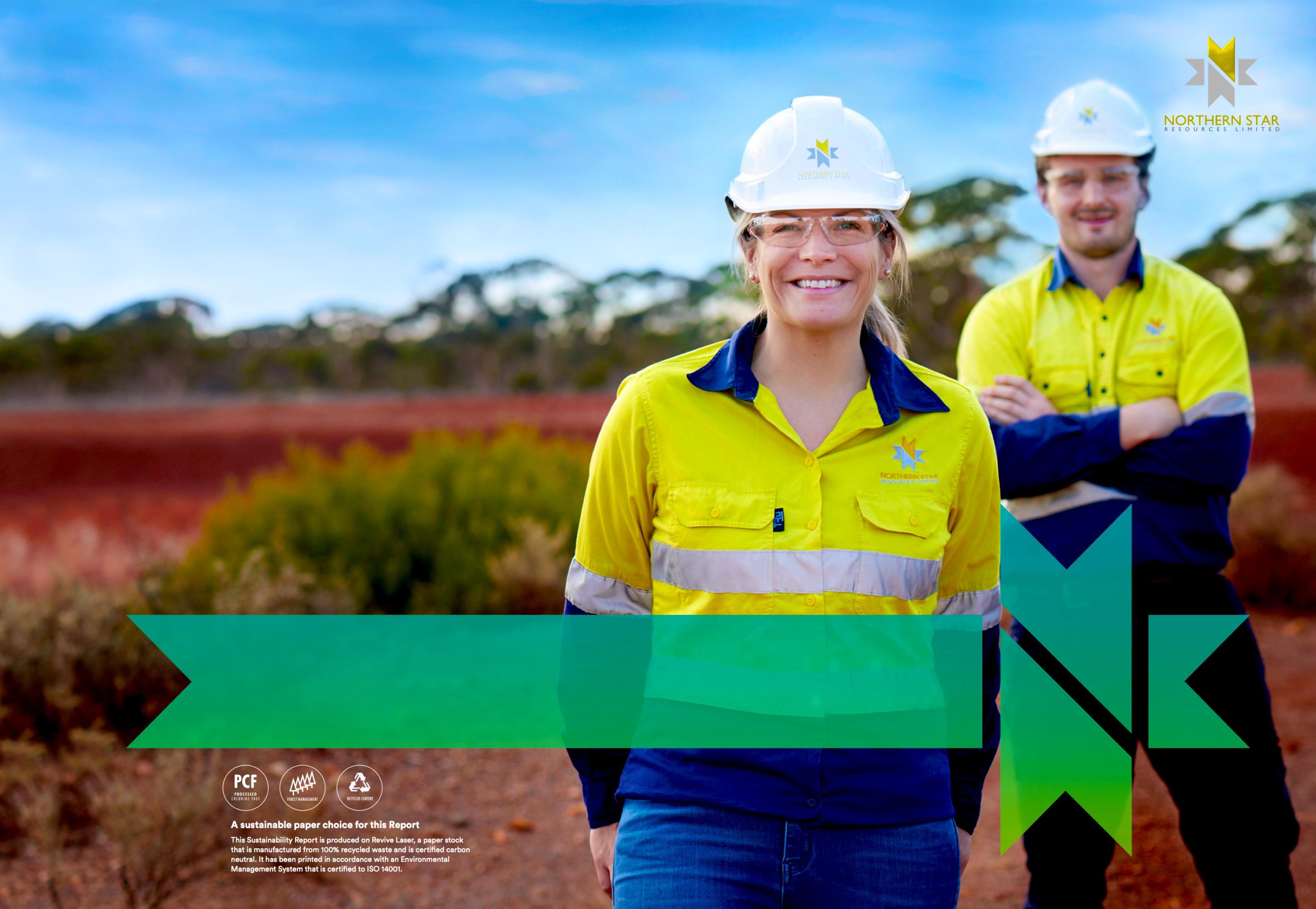
Northern Star Resources is one of the world’s largest gold producers. From 2019 to 2023 we designed its Annual and Sustainability Reports, creating a sub-brand for each: the same symbol, typeface and banner, in orange-red for the Annual Report and blue-green for Sustainability.

Annual Report 2020
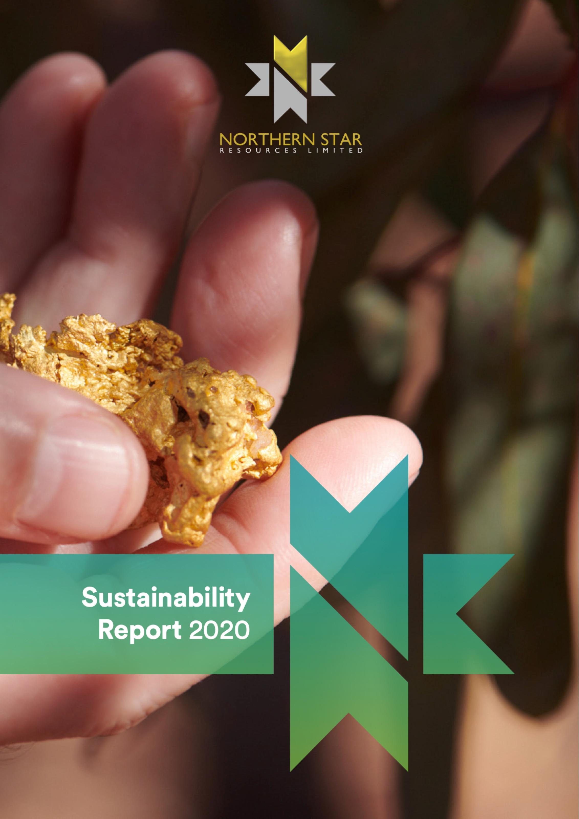
Sustainability Report 2020
The challenge
Northern Star publishes two major reports every year: an Annual Report for shareholders and a Sustainability Report for a much wider audience. Each needed its own clear identity, yet both had to feel unmistakably Northern Star and hold up across hundreds of pages of data, maps and photography.
What we did
We created two sub-brands from the master symbol: an orange-to-red gradient for the Annual Report and a blue-to-green gradient for Sustainability. Circular, a shared banner device and a common grid tie them together. Each year we art directed the covers and photography and designed every spread.




- Gold / Master brand#C7AB33
RGB 199/171/51 - Amber / Annual Report#EDAB20
RGB 237/171/32 - Orange / Annual Report#D56A27
RGB 213/106/39 - Teal / Sustainability Report#059CA7
RGB 5/156/167 - Green / Sustainability Report#75AC42
RGB 117/172/66
Headings and text, both reports
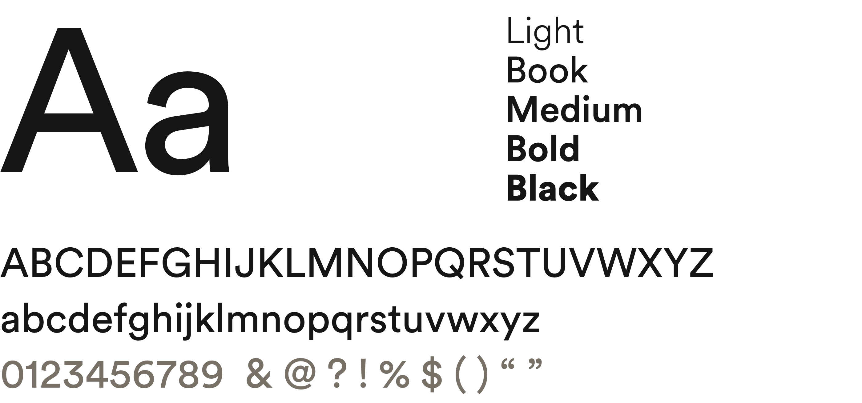
Circular
Light, Book, Medium, Bold and Black, across both reports
Report sub-brands
Both sub-brands are built from Northern Star’s own palette. Amber into Orange forms the Annual Report gradient and Teal into Green the Sustainability Report gradient, alongside the master Gold. Circular, set across both, keeps them in the same family.
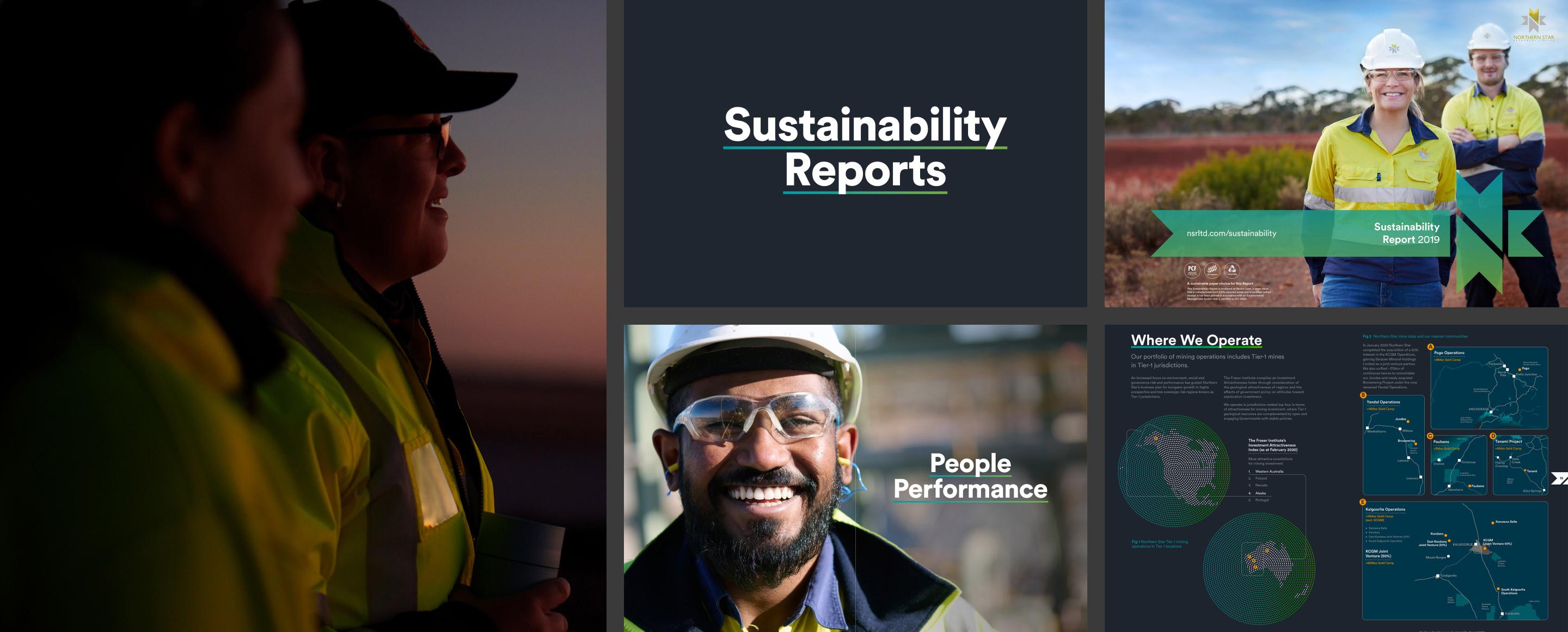
Sustainability Reports
A family of reports led by Northern Star’s people. Portraits from site open the covers and sections, and the teal to green gradient ties the photography, maps and data together.
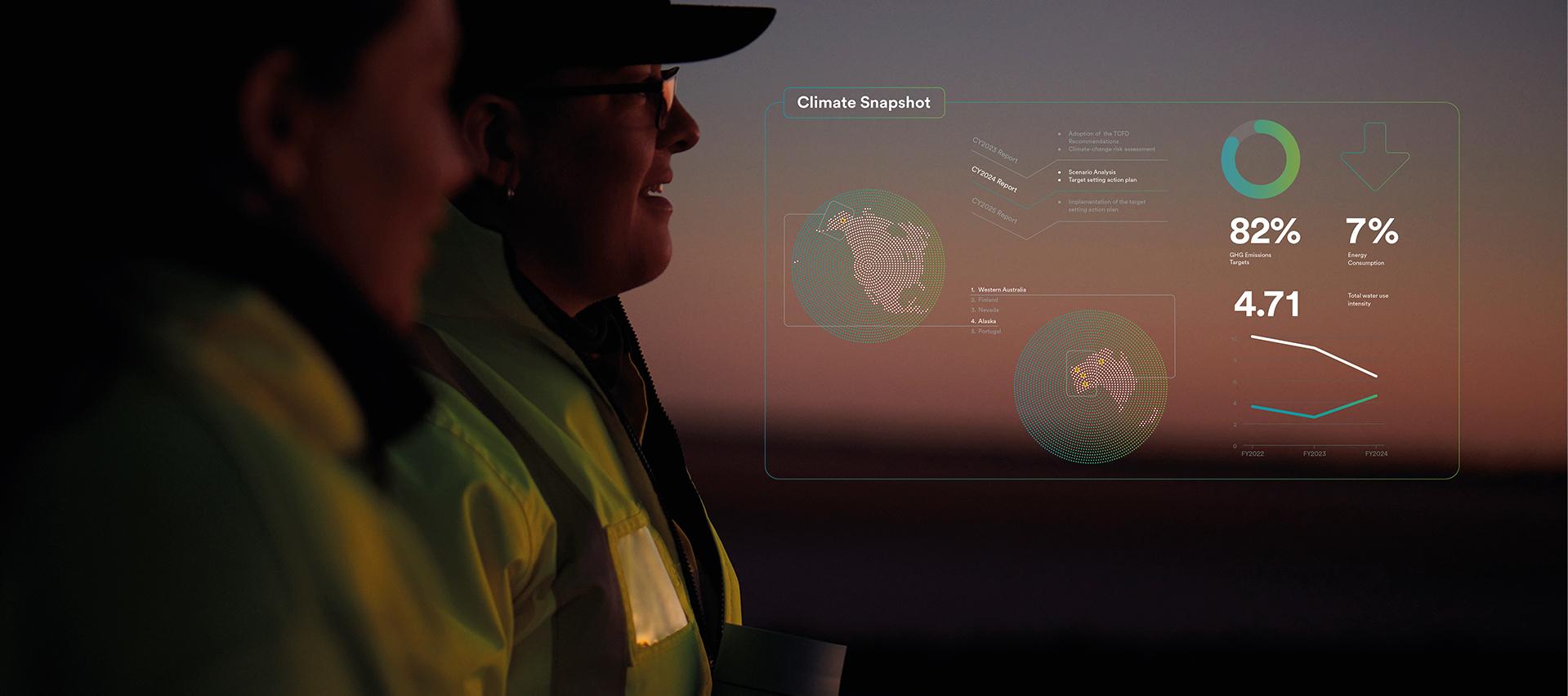
Climate snapshot
The data sits with the people behind it. Climate targets, maps and trends are layered over site photography, drawn in the same linework and gradient as the printed reports.
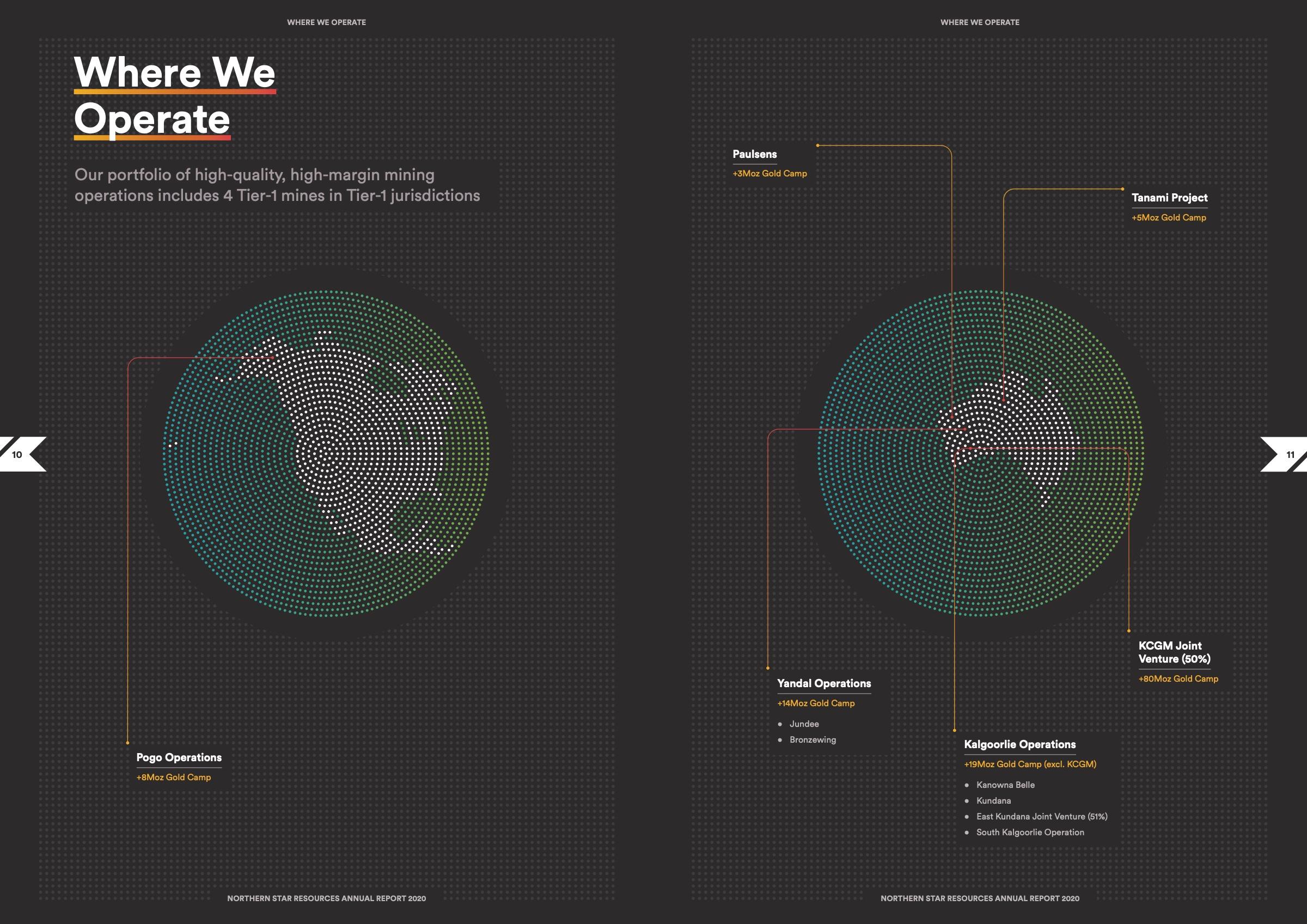
Annual Report 2020
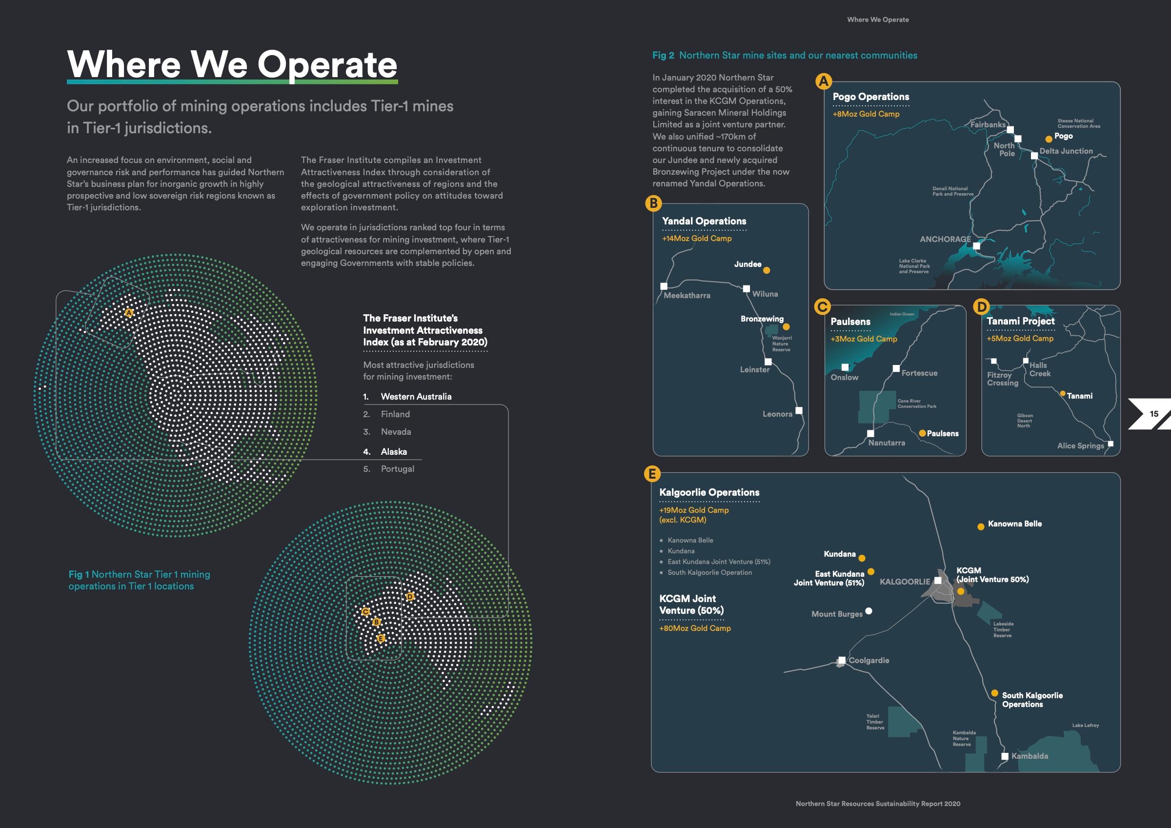
Sustainability Report 2020
Maps & graphics
Both reports map Northern Star’s operations the same way: dot-matrix globes, fine linework and gold site call-outs, with each report’s gradient carried into the headings.
Annual Report 2020
Sustainability Report 2020
Charts & diagrams
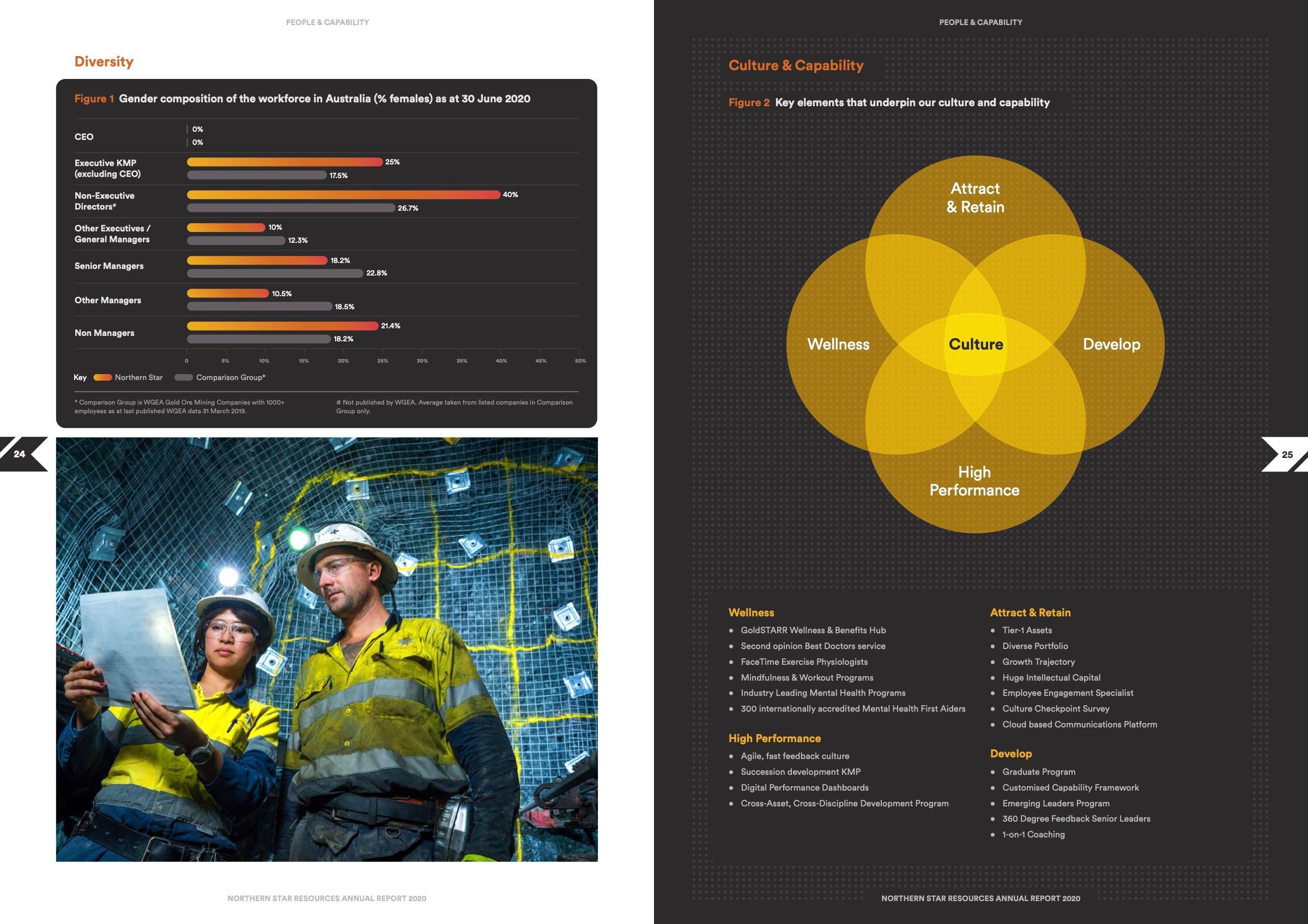
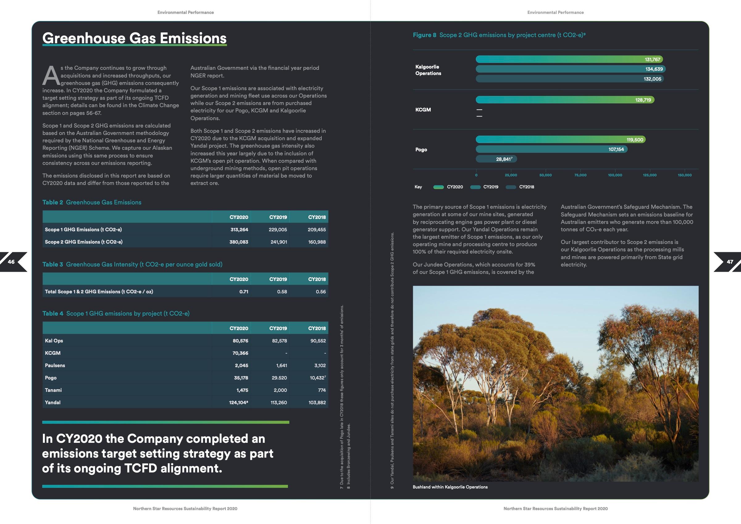
Data pages follow the same system. Workforce, culture and emissions figures become clear charts and diagrams on charcoal: orange and gold in the Annual Report, teal and green in the Sustainability Report.




Section openers
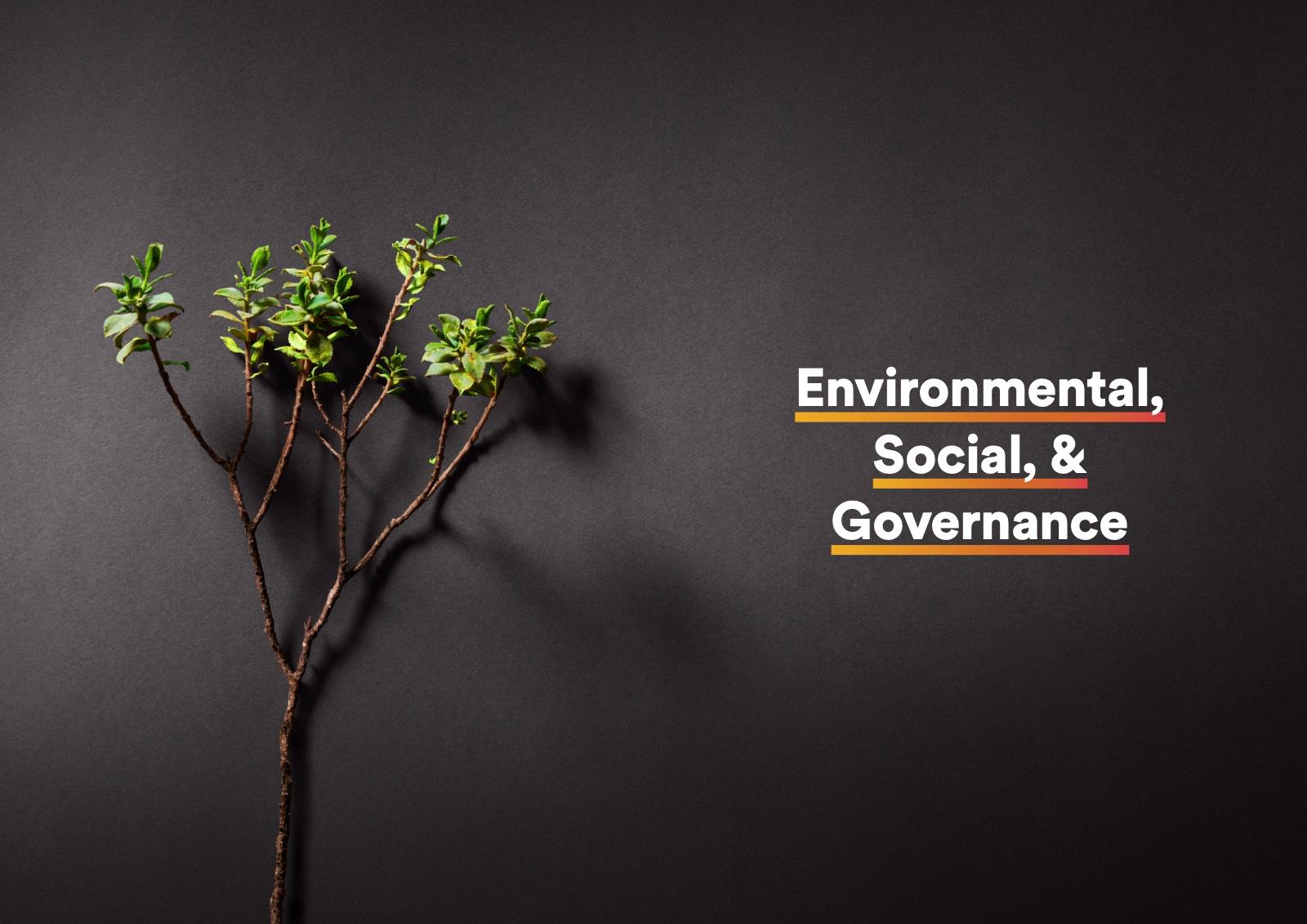
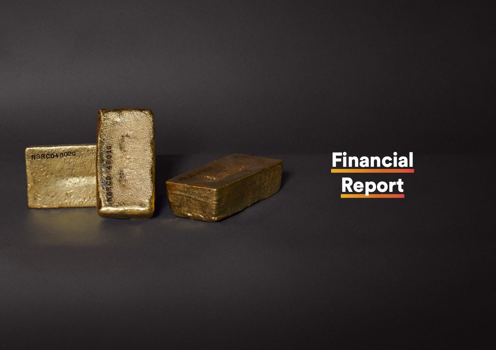
Every section of the 2021 Annual Report opens with a single object shot on charcoal: a hard hat, an ore sample, gold bars, a sapling. Quiet, consistent still lifes that give a hundred-page report room to breathe.
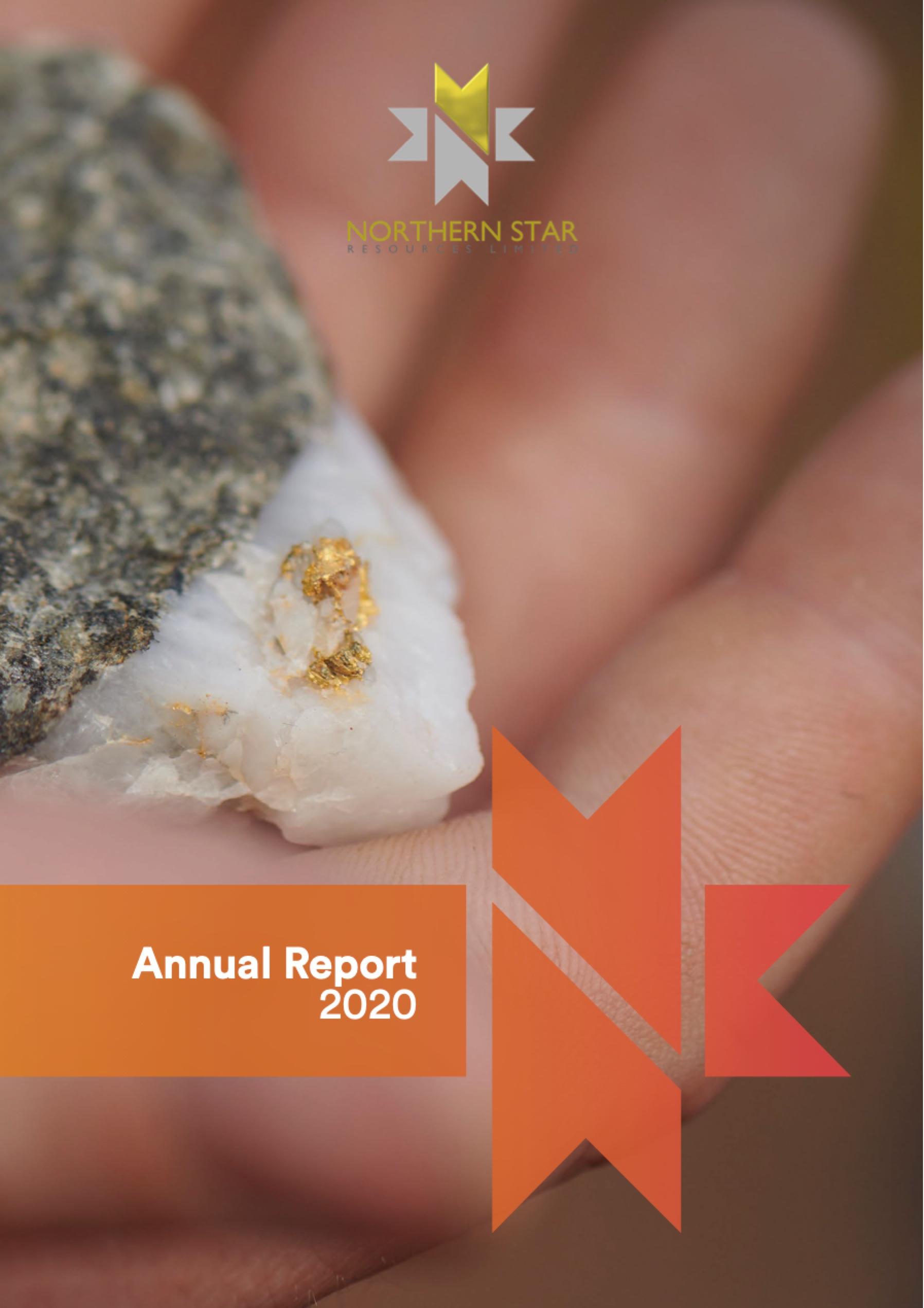
Annual Report 2020
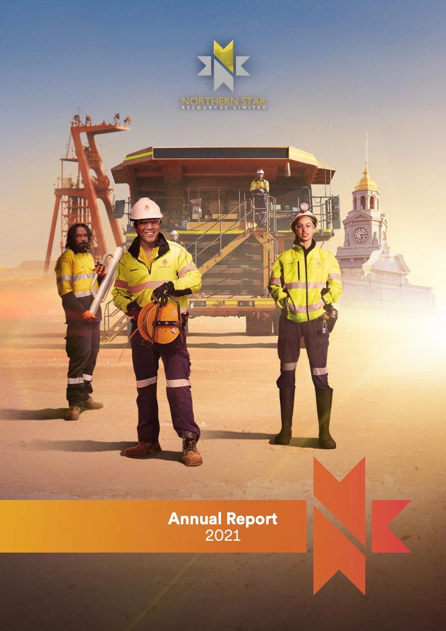
Annual Report 2021
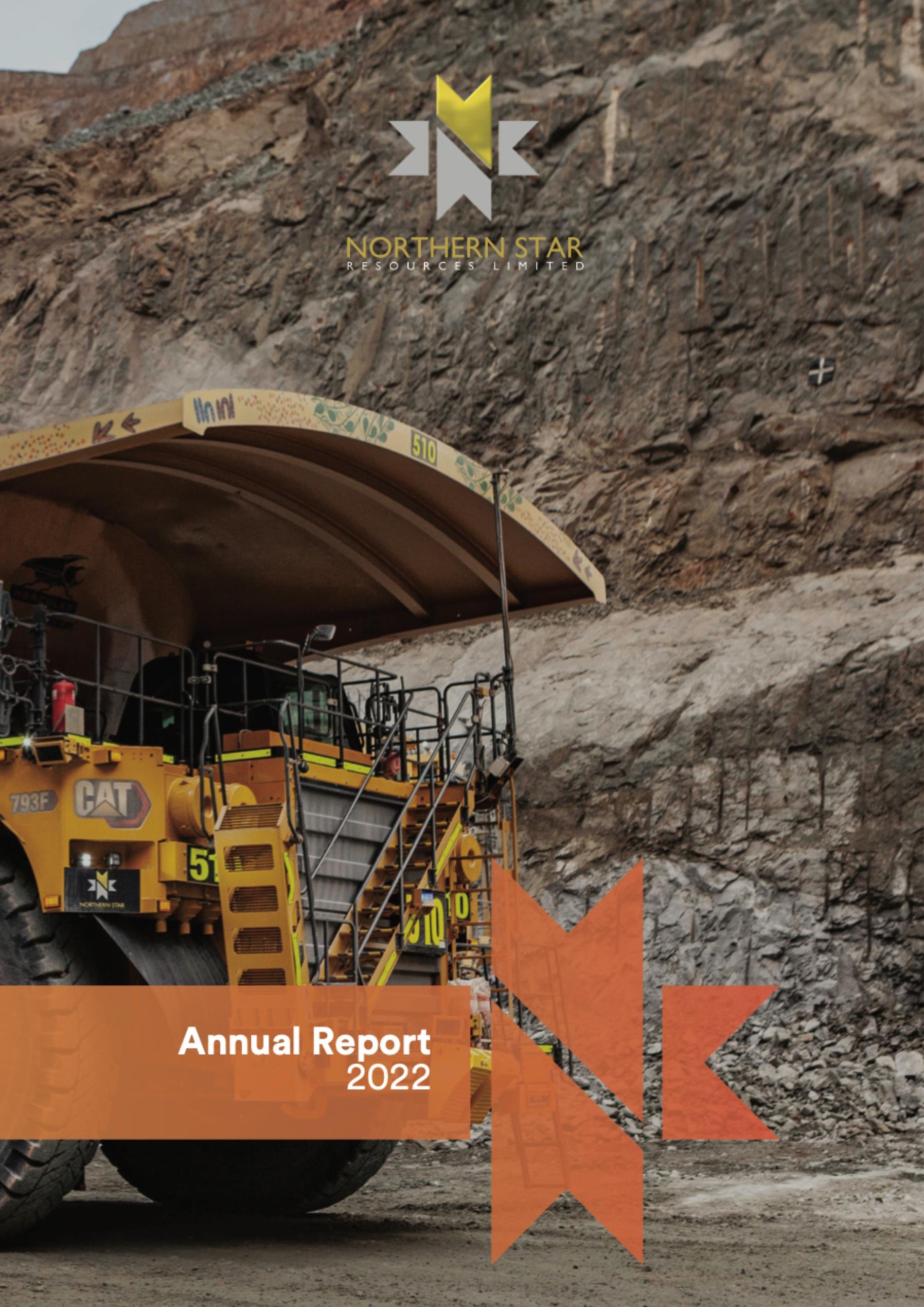
Annual Report 2022
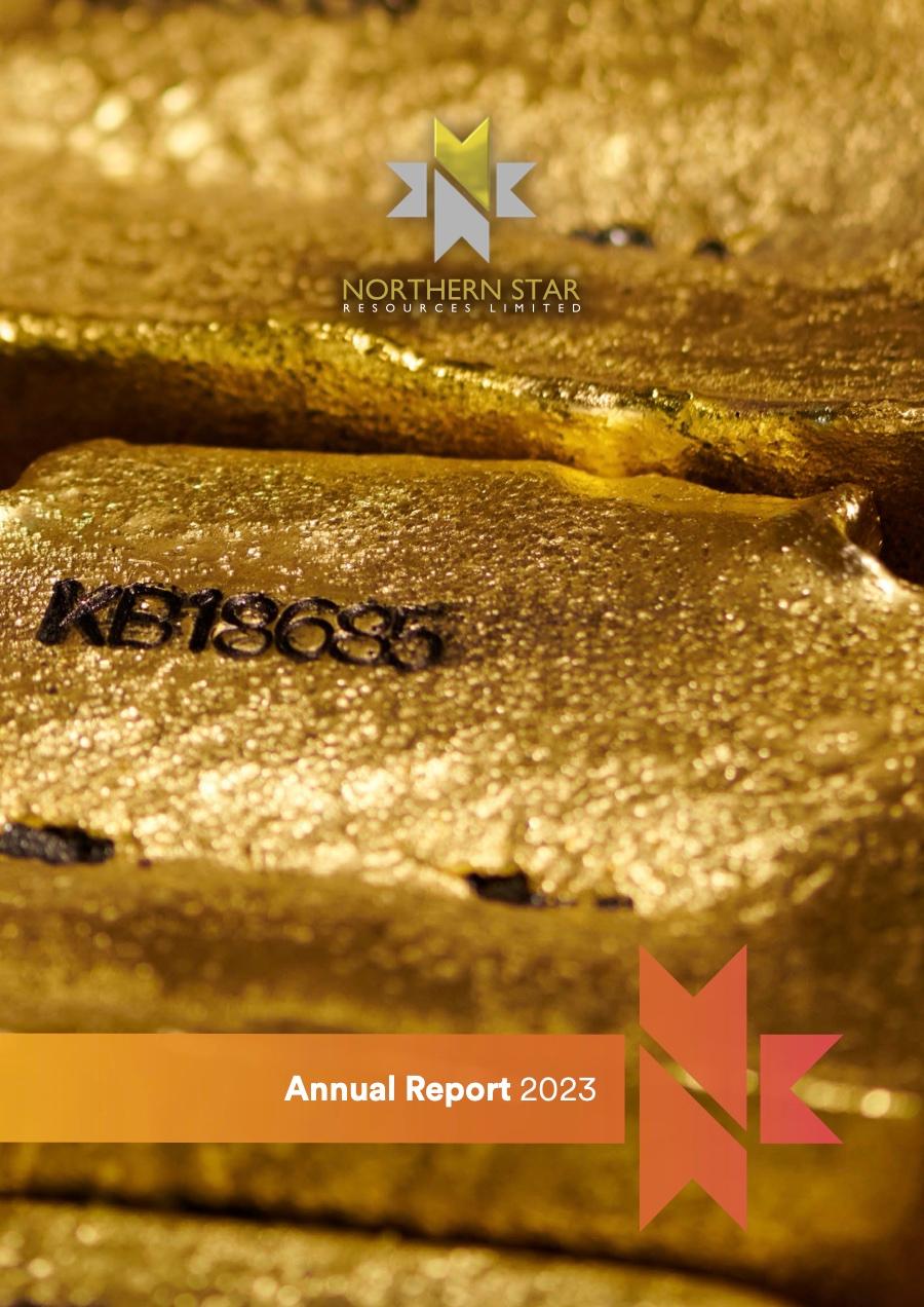
Annual Report 2023

Sustainability Report 2019
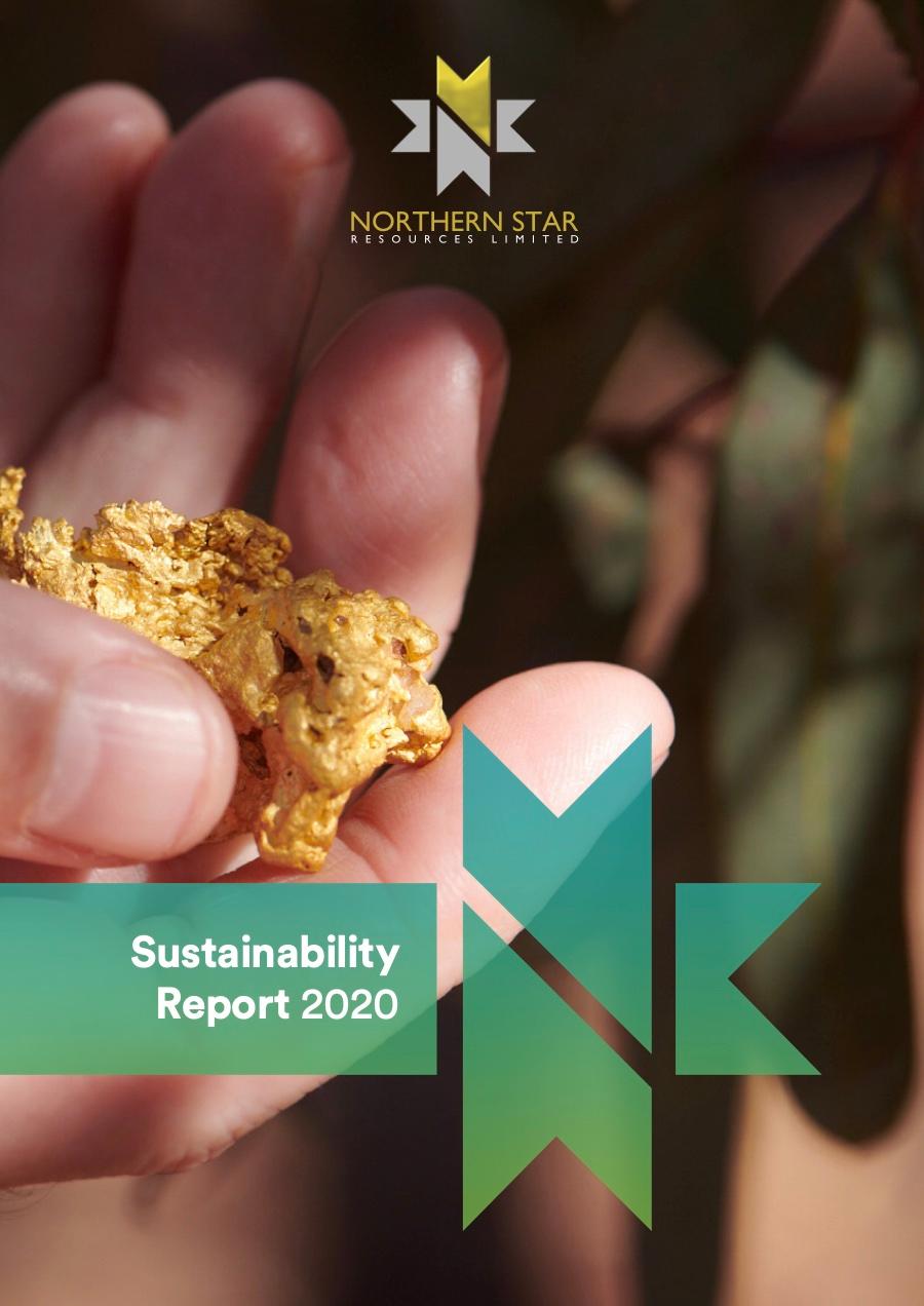
Sustainability Report 2020
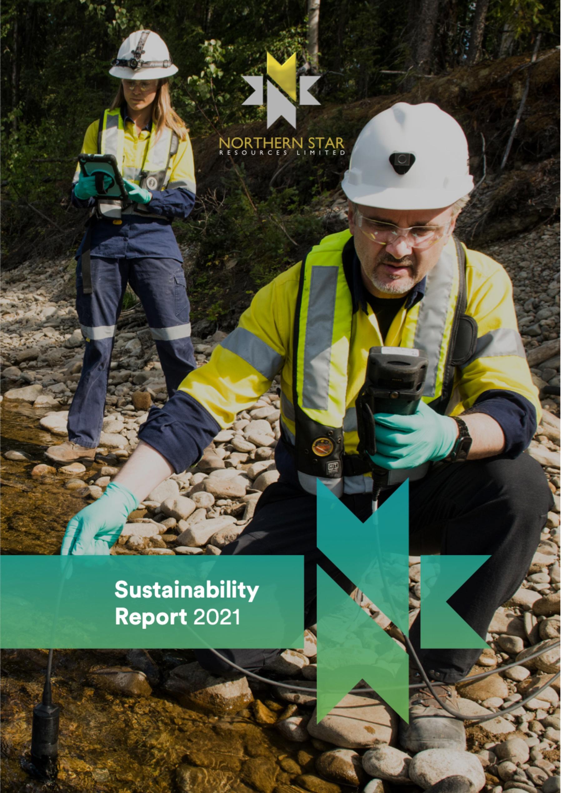
Sustainability Report 2021
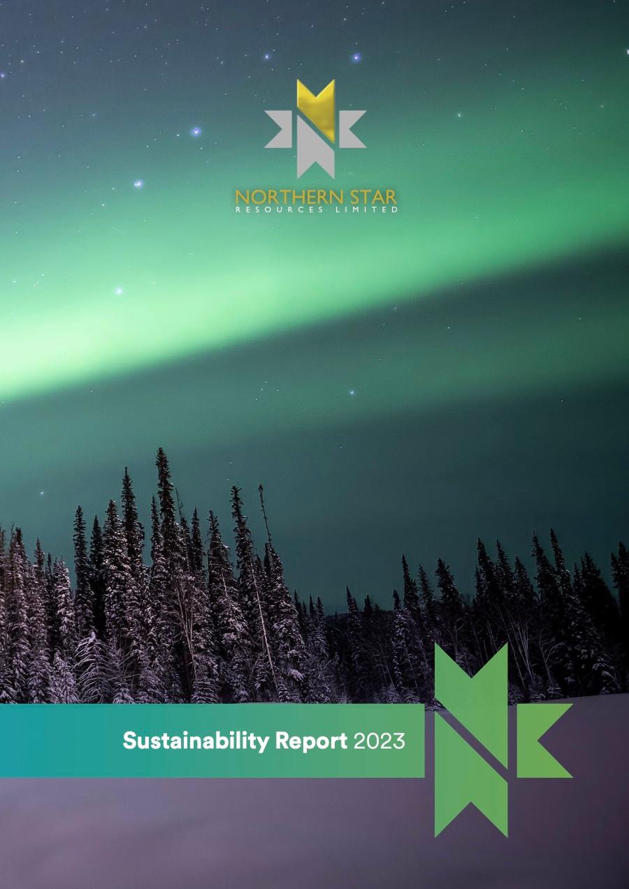
Sustainability Report 2023
Covers 2019–2023
Every cover pairs strong photography with the gradient symbol and banner: four Annual Reports in orange-red and four Sustainability Reports in blue-green, recognisable at a glance year after year.
The result
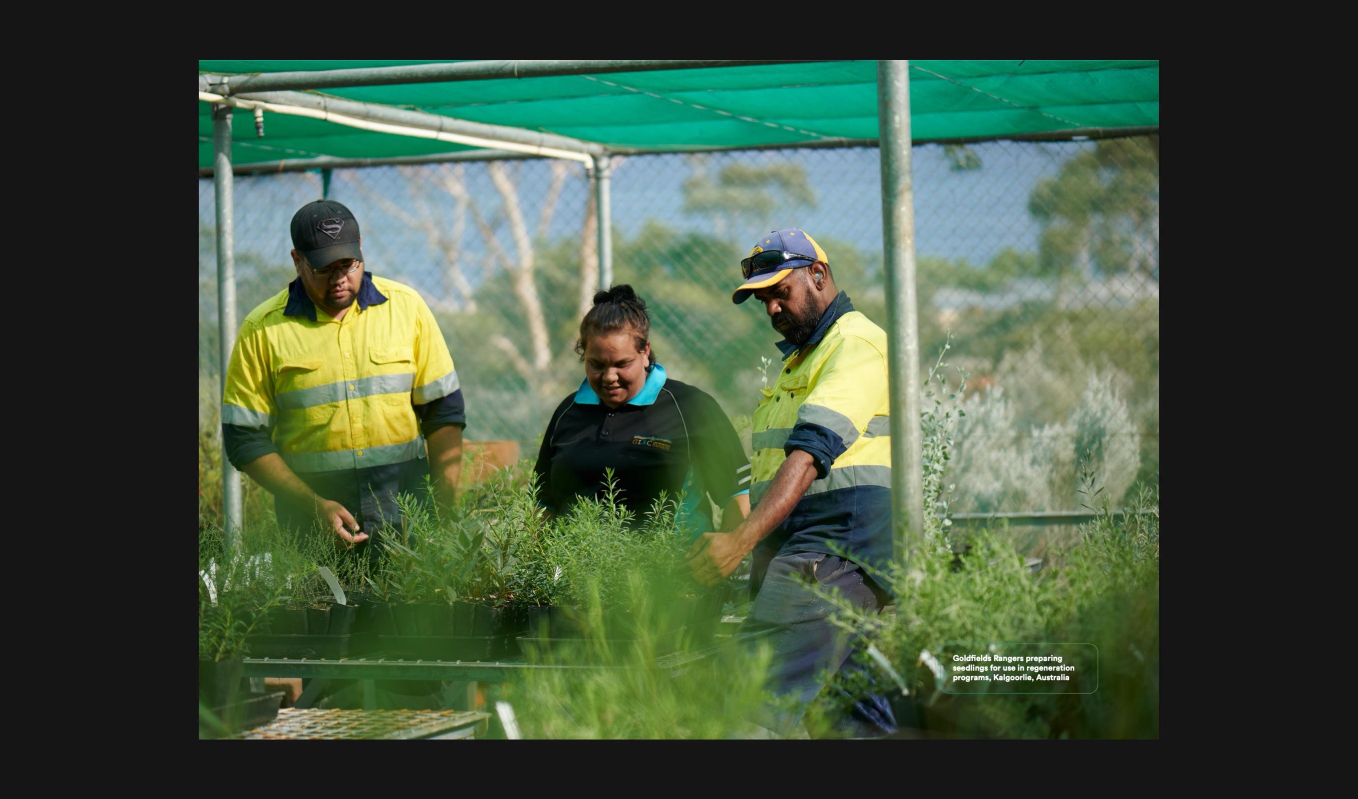
Sustainability Report 2019 / Goldfields Rangers, Kalgoorlie
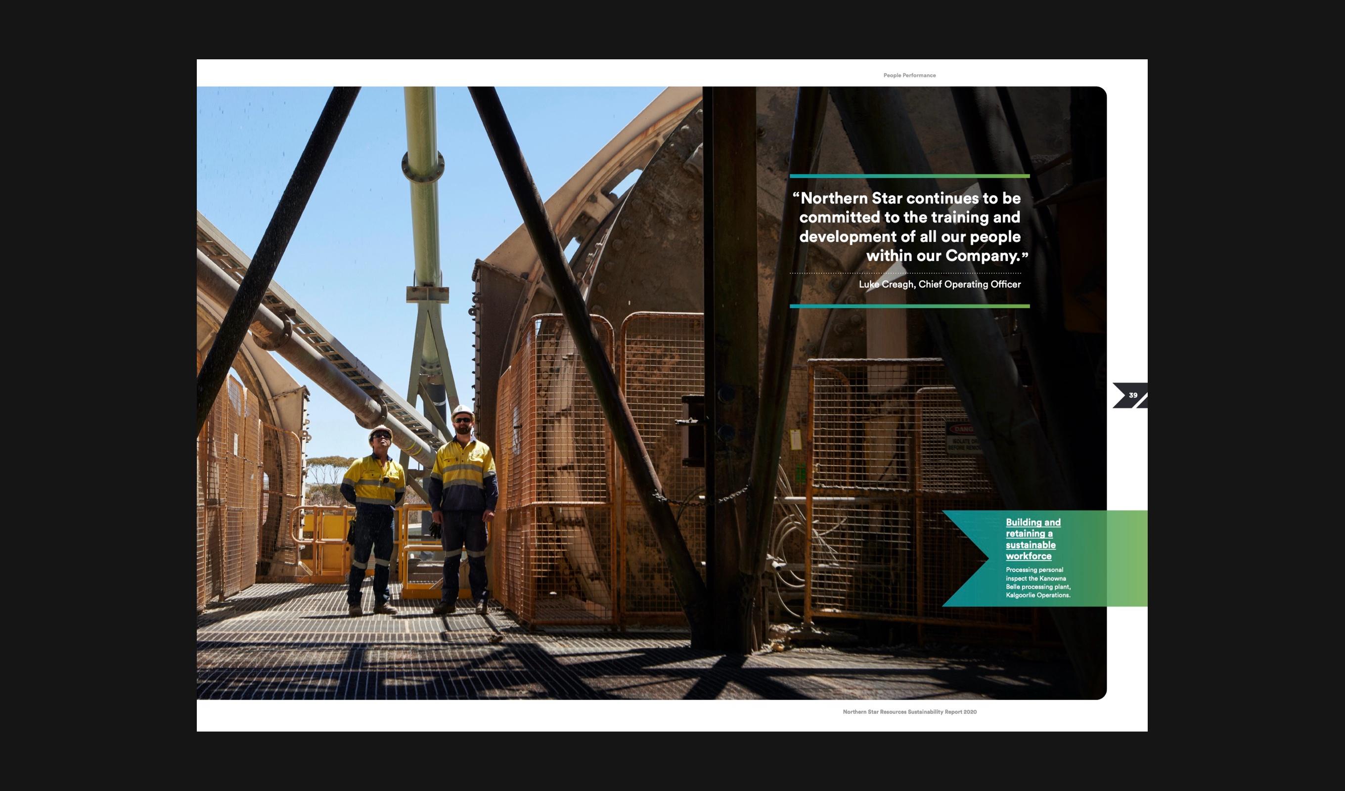
Sustainability Report 2020 / People Performance
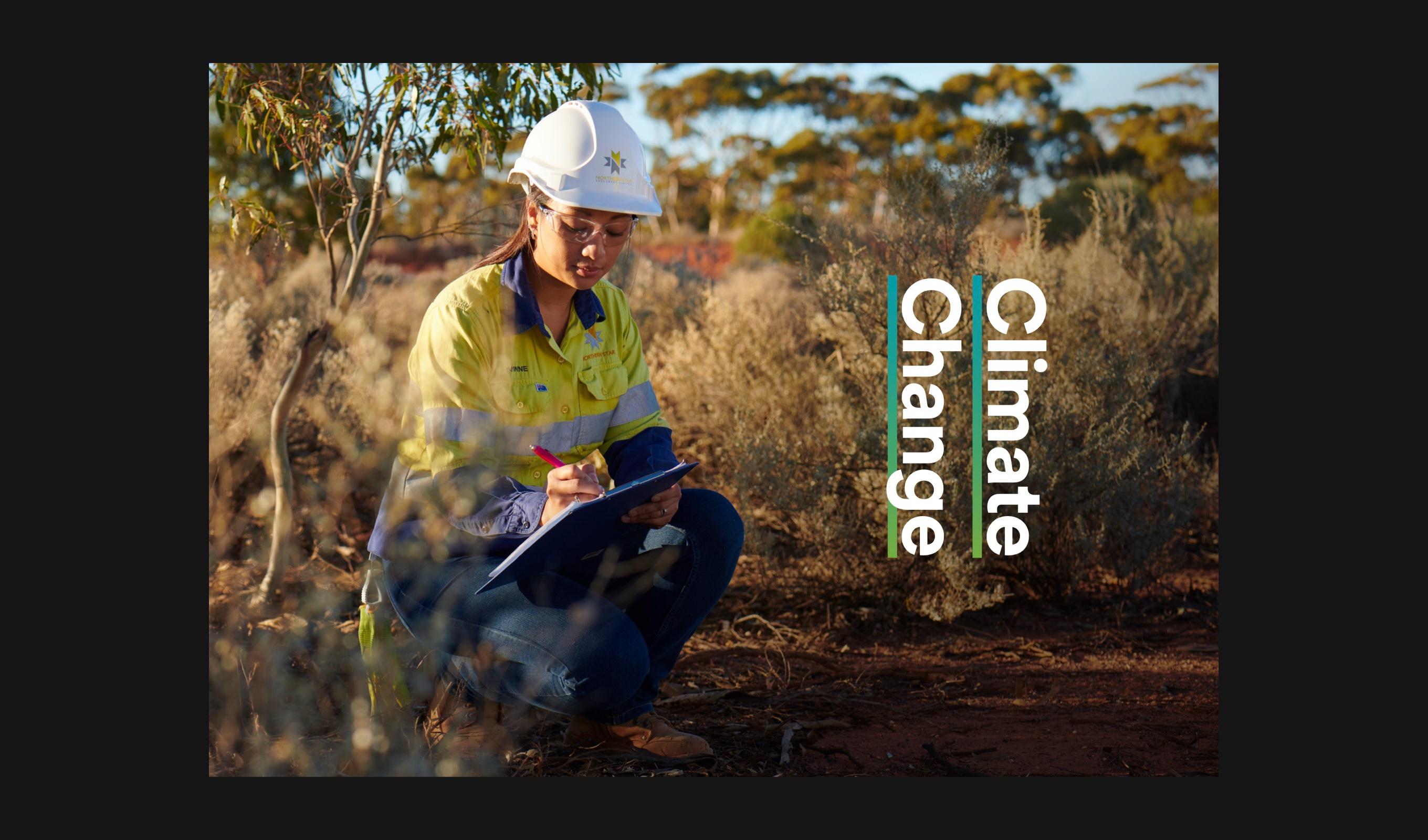
Sustainability Report 2020 / Climate Change opener
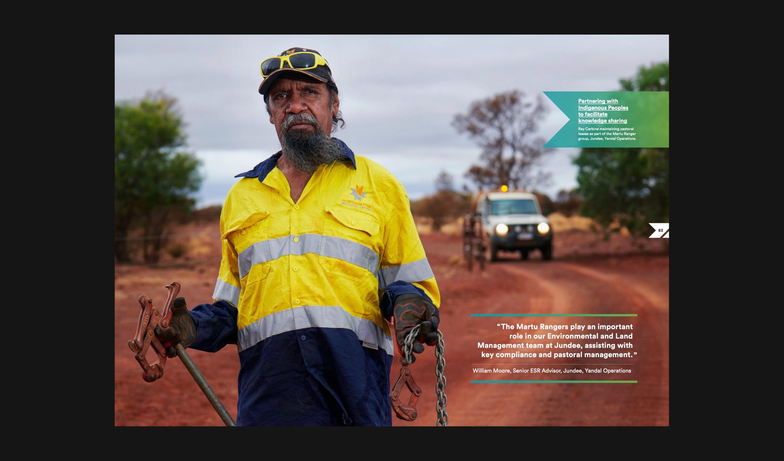
Sustainability Report 2020 / Martu Rangers, Jundee
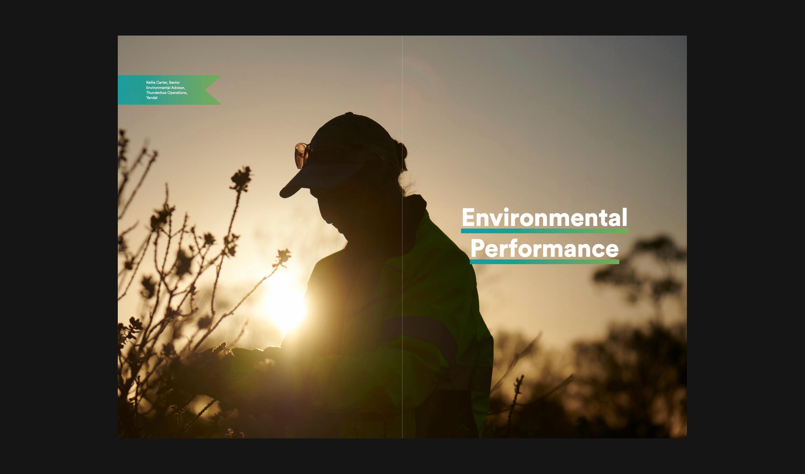
Sustainability Report 2021 / Environmental Performance opener
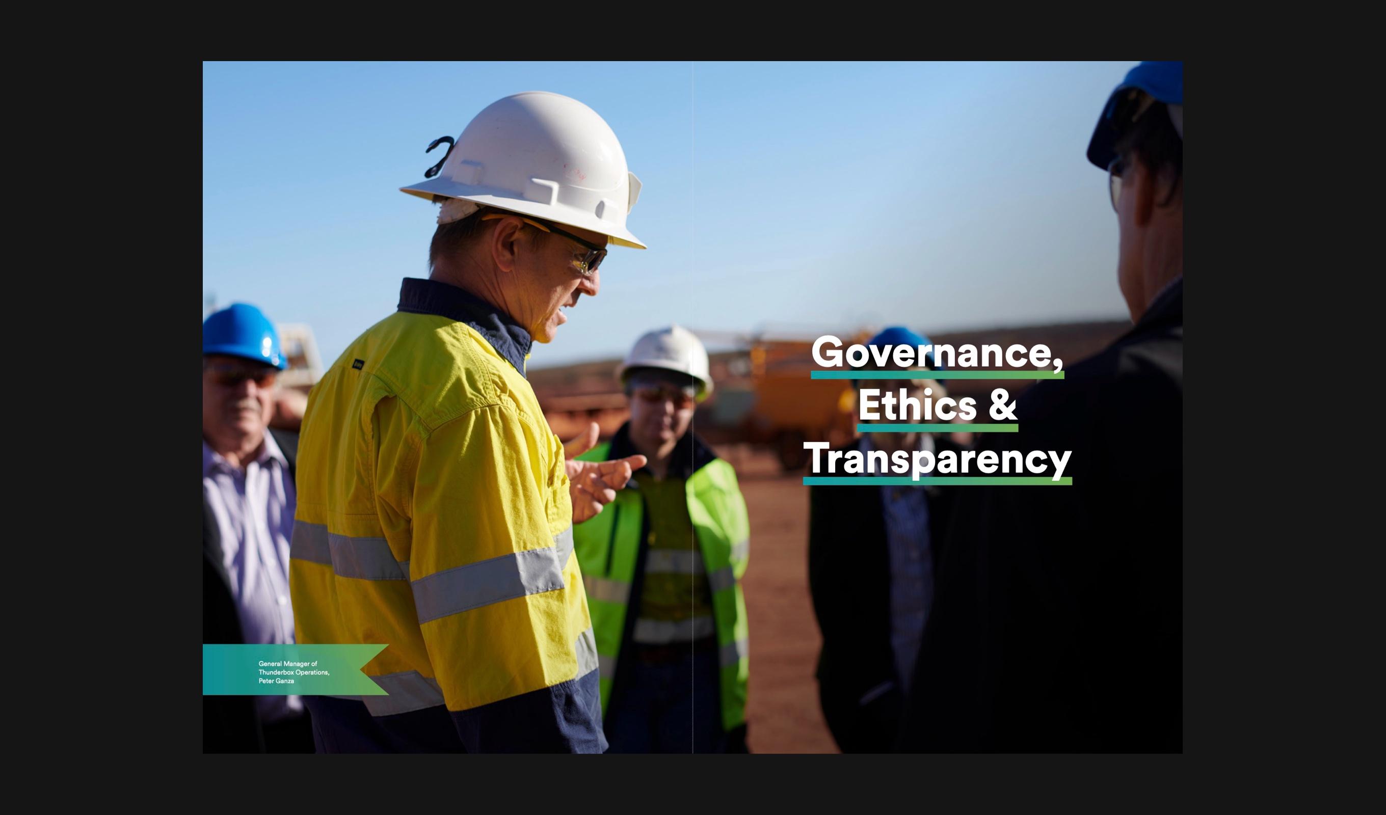
Sustainability Report 2021 / Governance, Ethics & Transparency opener

Sustainability Report 2023 / Environmental Performance opener

Photography / Before the shift
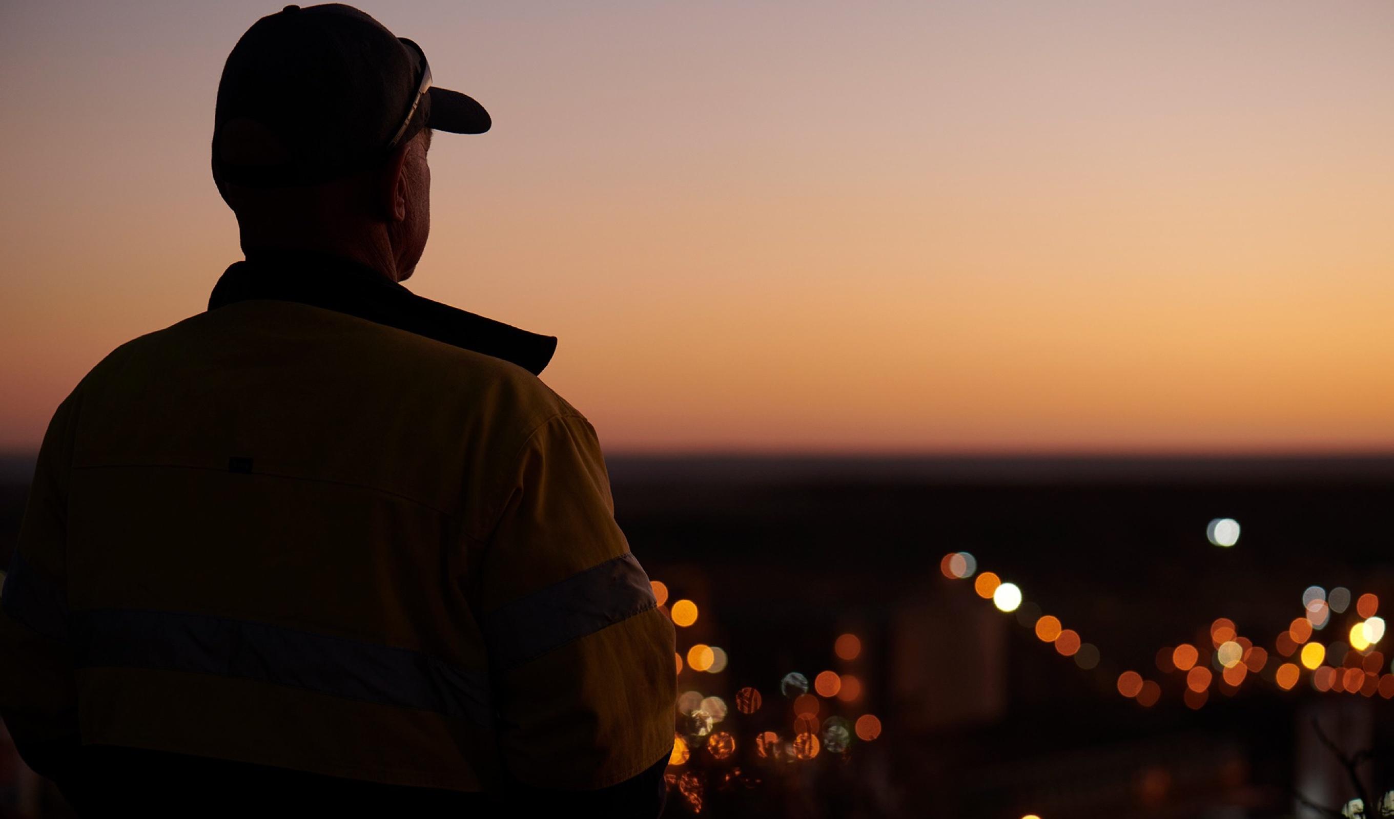
Photography / Overlooking the operation at dusk
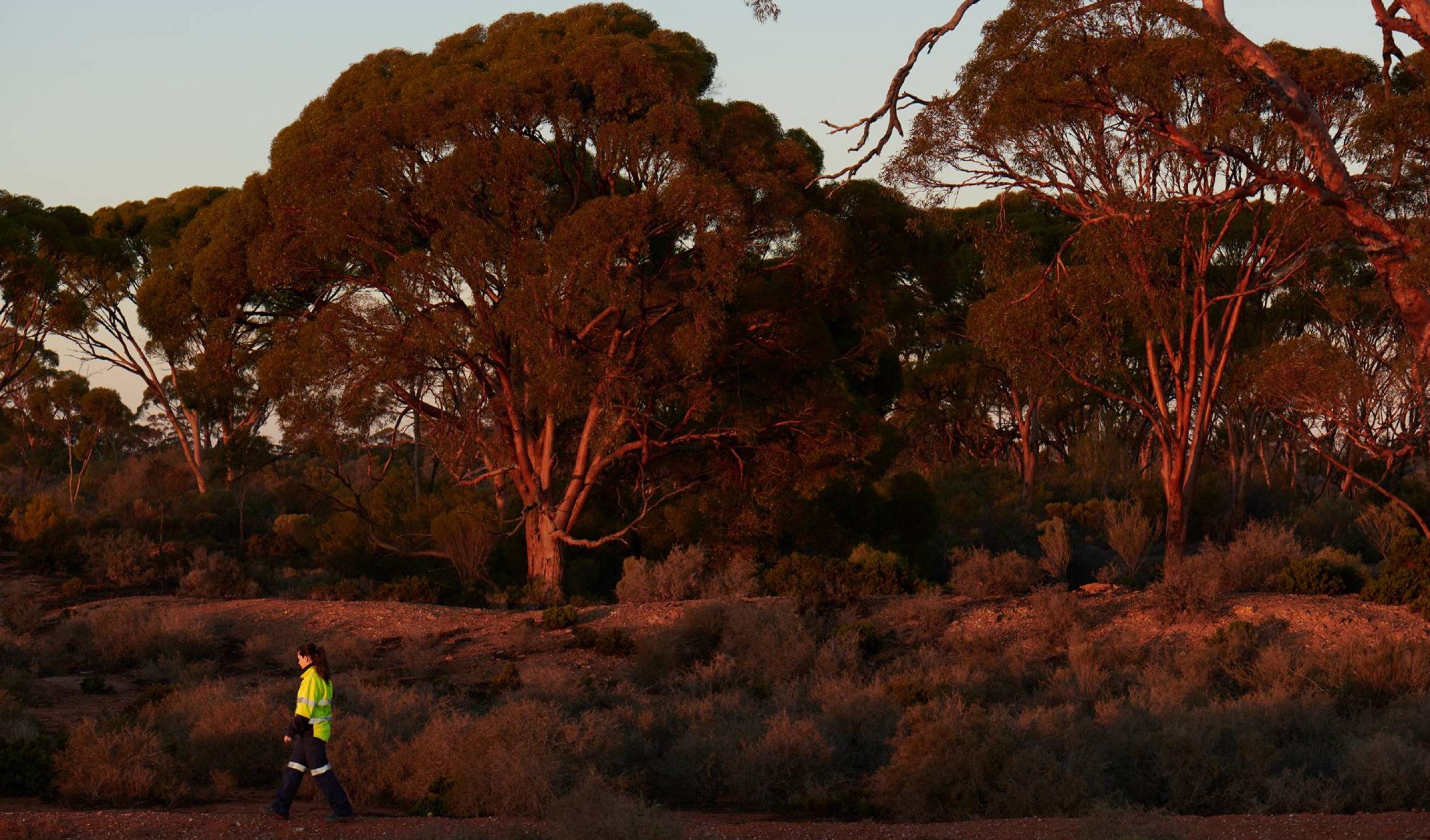
Photography / Goldfields bushland

Photography / Portrait on site
Over five years the two reports became a recognisable pair. A consistent system let each year’s story and photography lead, while the brand stayed constant from one report to the next.
Two reports, one family: a system that let Northern Star tell two different stories, year after year.